Updated on: February 5, 2026
Reading Time: 11 minutes
Post Views: 134
A well-designed website makes the first impression on potential customers and leaves a lasting impact on your business. However, building an effective website is not just about visual appeal; it requires careful planning, strategic thinking, and an understanding of user experience.
Unfortunately, neglecting crucial aspects of website design results in missed opportunities, poor engagement, and lost conversions. So to ensure that your website attracts and converts visitors into loyal customers, it’s important to avoid common website design mistakes that hinder your online success.
This comprehensive guide will serve as a helpful resource to help you be informed of the design pitfalls that might compromise your website’s performance. By addressing these mistakes and implementing effective web design principles, you can maximize the impact of your website.
So let’s explore the design mistake with a solution in detail.
1. Unclear Navigation
Navigation has a high effect on the popularity of the website. In this digital age, people want everything fast, and if they don’t find it on the website, they abandon it.
All website visitors will move to your site with the help of the navigation menu and breadcrumb navigation. They don’t like to spend time figuring out how to use navigation. Hence it is a common web design mistake to avoid.
If you keep hidden navigation menus or animated navigation that rolls and bounce makes users confused. They will think about whether they are on the right page.
On the other hand, clear menus and breadcrumbs help users easily navigate the website and remain on your website for a long-time.
2. Non-Responsive Design
In this digital era, most people use different mobile devices other than PCs to access the website. It means your website design needs to be responsive and work brilliantly on screens of all sizes.
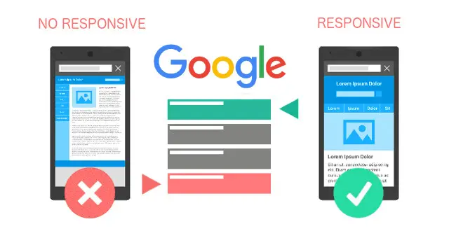
Responsive design is a method that emphasizes creating websites that should automatically adapt to the user’s behavior and environment depending on the screen size, platform, and orientation.
According to Statista, mobile devices generate 54.8 percent of global website traffic.
If you don’t prioritize responsive design for both mobile and desktop, you will lose out on traffic, conversions, and sales. So it is the right time to make your website responsive with help of best responsive website design services and grow your business.
3. Slow Loading Speed
Users don’t like to remain for long on a site that is slow to load.
To ensure that your website loads quickly and offers a great user experience, you need to focus on some essential things.
Firstly, you need to focus on optimizing the website’s images and if the size of the images is big, try to reduce it.
Secondly, plugins, themes, and third-party libraries affect a website’s speed. Hence, you need to update these things to the latest version constantly.
Lastly, test your website every time after the update. When you follow these things, you can identify the mistakes and correct them before the launch.
Also Read: 10 eCommerce UX Best Practices to Follow
4. Using Generic Images
Whenever you integrate free stock photos on your website, it does not provide clarity to the users. Also, it creates a weak impression of your website. These images turn visitors off from your website. Therefore, you should avoid this crucial web design mistake.
Instead, you should integrate original photos on your website which convey some story or teach something important.
5. Not Having a Favicon
The majority of users keep various tabs open while browsing online. If your website does not have a favicon, users cannot identify it quickly.
On the contrary, the favicon makes navigation easy and helps users find what they need and return to their desired tab.
By using a favicon, you allow users to identify your website. It also helps in branding.
6. Using Carousels
Carousels are one of the things that are used by various websites worldwide. However, they have issues like low visibility, slow loading, etc. Moreover, they distract users and grab their attention from one thing they are focused on. Hence, they are considered conversion killers.
Therefore, you should avoid using carousels on your website and focus on presenting the most important message on the homepage.
7. Autoplaying Videos with Sound
Users find it frustrating when visiting a website or a web page where videos start from anywhere. Moreover, videos affect the loading speed of the website.
Therefore, if you want to provide a better experience to users, you shouldn’t autoplay videos until a user takes action. For instance, a user reaches a specific section on the page having a video.
8. Using Vague Fonts
Users find it difficult to read on your site whenever you use cursive fonts, handwritten scripts, or symbols. Moreover, they will have issues with cognitive fluency, which means they would find it challenging to understand the information. Therefore, using vague fonts is a common typography web design mistake to avoid.

9. Adding Too Many Fonts
Integrating more fonts into a website creates confusion in the mind of the users. They feel distracted while accessing the information on the website. It is yet another typography mistake that you should avoid.
Continuously changing the fonts on the website is also not good. It reduces cognitive fluency and further decreases the user’s focus on the website.
Therefore, never use different fonts and styles on your website. A general rule of thumb is to use 2 to 3 fonts on the website.

10. Using Opposing Fonts
Using two fonts that are conflicting with each other is not great. These fonts draw the attention of the users away from the information you want to convey. Hence, it is one of the common typography errors you should avoid for offering a positive experience to the users.

You need to ensure that font size is standard. Also, there is proper spacing between characters.
11. Content Not Focused on Target Audience
If you are writing too much content or too little content mentioning your business & how great you are, you might be losing many users.
It happens when your content marketing efforts don’t focus on the user’s goals, visions, problems, fears, and solutions.
One of the simple strategies is to create a user persona of the target audience and then integrate content such as blog posts, product/service pages, etc., considering your potential audience.
12. Not Using Whitespace Properly
Whitespace is the space between the text, images, graphics, and other blocks on a website.
If you have integrated whitespace properly, it helps you attract users, increases readability & comprehension, improves navigation, creates a balance between image & text, and makes your brand unique.
If there is no whitespace, the user finds it difficult to read the website. On the contrary, too much whitespace also affects the website.
Therefore, use whitespace effectively to convey your message and fulfill the potential user’s goals. To understand well, check out these minimalist website design examples where whitespace is used properly.
13. Having Content that isn't Scannable
Most people don’t like to read websites like they read books. Rather, they usually want to scan the content that is relevant to them. Besides this, users don’t have the patience to remain on one site for a long time. Therefore, your website content needs to be scannable.
To make your website content scannable, integrate various descriptive headings, add bullet points & lists, highlight key phrases, and use shorter paragraphs. Besides this, you can also add images with some captions to convey your message.
When you follow these things well, you can engage visitors on your website and urge them to take a specific action.
14. A Lack of Clear CTA
A call-to-action is the main element on a webpage that urges users to take a specific action.
If your website doesn’t have a clear CTA, it is one of the most common website design mistakes.
CTAs are the most crucial thing in a website to complete the sales funnel. They are used to convert first-time visitors to prospects.
Therefore, if you don’t have a proper CTA on your website, you might be losing a big chunk of leads. Besides this, if you integrate many CTAs, then users might get irritated.
To avoid these things, you should integrate a CTA that informs users of the actions they have to take. Here, users should be able to understand what they have to provide and what they will get in return.
You can use compelling phrases that urge users to click on CTA. However, make sure that your CTA is clear. Also, keep the form filling short.
Lastly, add some of the CTAs popular across the world, such as Get Started, Subscribe Now, Sign Up, Buy Now, etc., based on the need.
15. Not Focusing on 404 Pages
A 404 page is also called an "error page" or "Page not found" page. This page usually gets displayed when a user reaches the desired domain; however, their URL path doesn’t have any information.
On a website, 404 pages are responsible for the decrease in traffic. Moreover, a survey of 3,475 users indicated that about 39.2% of people don’t even take action to solve the error.
It indicates that a 404 page plays an essential role in any website.
Your primary purpose of a 404 page should be to convert a user’s negative encounter into a positive one. To achieve this, you need to create a custom 404 page for your website.
There are several well-known strategies that you can implement on your 404 pages.
- You can induce some humor on the 404 pages.
- Provide some communication options to the users.
- Lastly, you can provide some navigation links to the users.
16. Having Infinite Scrolling
Infinite scroll is a web design strategy. Here, whenever a user reaches the bottom of the page, new content loads automatically.
Even though it might look good to keep users hooked on the webpage, it harms your website.
You may have a question, how?
Google bot can only crawl a web page loaded for the first time and avoid going further. Hence, it affects your SEO.
Infinite scrolling takes a lot of time for loading, and users find it hard to access content on your website. Therefore, you should avoid infinite scrolling in web design.
17. Too Many Ads Above the Fold
A user visits a web page to find a solution to the problem through content.
However, with too many ads placed above the fold, users might leave your website.
Moreover, Google penalizes a website with too many ads above the fold. Hence, you should place only one banner above the fold.
If you need help with the proper placement of ads, our team can assist you with PPC management to optimize your ad strategy, enhance user experience, and comply with best practices.
18. Disruptive Pop-ups
Pop-ups are also known as overlay ads that cover the entire content on the website. Here, users can’t view the main content and are forced to watch the ad or find the button to close it.

A situation like this affects the bounce rate here. If more visitors close a page within a few seconds of their visits, it results in a high bounce rate, and Google gives that site a low ranking.
If you don’t have other options but to include pop-up ads, you can do the following things.
- Firstly, you can show users a pop-up when they remain on your site for 30 seconds.
- Secondly, you can display a pop-up to users after they scrolled the page 50%.
- Lastly, you can create highly-relevant pop-ups that grab the user’s attention.
19. Roadblocks
It is a type of full-page advertising which is way ahead of full-screen floating ads. It redirects the user to a unique URL, including a button for the user to move ahead to their destination.
Whenever users get redirected to a specific URL from the site they are browsing, they suppose it is a spam link. Hence, the majority of users click on the back button. This further results in a high bounce rate as compared to pop-up ads.
Therefore, you should not integrate these types of ads on your website.
20. Ads Hidden as Content
Some sites hide the ads just like the content to get traffic from pay-per-click users.
Several basic methods consist of a related content section having a chunk of links to other similar topics or a navigation bar that directs you nowhere.
All of these are regarded as ads, and they fool users into clicking on ads. Moreover, Google can penalize these kinds of ads. Hence, you shouldn’t include these types of ads.
21. Multiple Ads Separating the Main Content
Several sites like to take most of the benefits of ads; hence, they place the ads within content rather than on the side or the bottom. Thus, placing multiple ads on a webpage results in a dispersed pattern. The pattern includes content, ad, content, ad, and so on.
Google quality guidelines consider it as a bad design that disrupts the flow of the user. Hence, it is one of the most common web design mistakes to avoid while placing ads on the website.
Lastly, if you want to insert an ad inside the content, keep it one for each page.
22. Difficult to Find Contact Info
Not having accurate contact information on the website is another common web design mistake you need to avoid.
Anytime a user makes a decision to buy a product or use your services, they are looking for your contact information. However, if they cannot find it quickly, they will leave your website, and you will lose leads.
Therefore, you need to ensure that you have integrated the contact us page properly on your website. A better strategy is to allow users to contact you via different mediums such as contact numbers, email, skype, or social media handles.
Lastly, it is not required to have a fancy contact us page; users are just looking to contact you, that’s it.
23. Unclear Brand Messaging
One of the other common website design mistakes is having unclear brand messaging. The most obvious way to distinguish yourself from the crowd is to use your branding effectively in your messaging.
It is something that all the giants do, and it’s something you should pay close attention to as well. Brand messaging that is unclear will cause more harm than you anticipate. Visitors will depart if they cannot figure out who you are or why they should trust you.
If you want to get out of this, you should focus on one of the essential elements, i.e., storytelling.
With clear & effective communication, you can attract the audience and connect with them emotionally. Your message should depict your brand’s future goals, values, and beliefs.
If you want to convey your message clearly, the first step is to develop a distinct persona for your company. Then try to communicate with your audience in that same tone and voice. For instance, if your brand is a person, you will provide some characteristics and features.
In short, you should focus more on the pain points of the users and less on what your company does. By this, you can gain more traffic and leads.
Final Words
Here we conclude our exclusive list of common web design mistakes. It would be best if you avoid these mistakes while updating your website. Besides this, you need to prevent website mistakes while creating a new website. If you cannot find issues on your website or want to build an error-free website from scratch, don’t hesitate to contact us.
WebyKing offers the best web design services to startups and businesses worldwide. Hence, we can understand your business requirements and provide you with the most suitable solution.
Frequently Asked Questions (FAQs)
What are the most common website design mistakes to avoid?
Common website design mistakes include poor navigation, non-responsive layouts, slow loading times, excessive ads, unclear CTAs, and cluttered visuals. Avoiding these can improve user experience and conversions.
Why is mobile responsiveness critical for websites in 2026?
Mobile responsiveness ensures a website works smoothly on all devices. With over 50% of traffic coming from smartphones, a non-responsive site can drive users away and hurt SEO.
How does website speed impact user experience and SEO?
Slow websites lead to higher bounce rates and lower user engagement. Search engines also rank faster sites higher, making page speed crucial for both UX and SEO.
What makes a call-to-action (CTA) effective in web design?
An effective CTA is clear, action-oriented, and easy to find. Phrases like “Get Started” or “Buy Now” work well when paired with compelling design and minimal distractions.
Why should websites avoid using too many fonts?
Using too many fonts creates visual clutter and confuses users. Limiting your website to 2–3 readable fonts maintains a clean, professional look and improves readability.
How can I make my website content more scannable for users?
Break content into short paragraphs, use bullet points, descriptive headings, and highlight key phrases. This helps users find information quickly and boosts engagement.
Ravi Makhija, the visionary Founder and CEO of WebyKing, is a seasoned digital marketing strategist and web technology expert with over a decade of experience. Under his leadership, WebyKing has evolved into a premier full service web and marketing agency, delivering innovative solutions that drive online success. Ravi’s deep understanding of the digital landscape combined with his passion for cutting-edge technologies empowers him to consistently exceed client expectations and deliver results that matter.


")