
A website is the most crucial aspect of your business. It should answer all the questions of the users about any product or service you are offering. Moreover, it should help you to convert your prospects into leads.
To achieve this, you need to engage users constantly on your website. However, due to some common reasons, you might not be able to engage users and increase sales.
These common reasons include complex navigation, outdated design, unnecessary features and functionalities, slow speed, high bounce rate, etc. In all such situations, you should think of the website redesign.
Now, if you are still confused about whether to redesign the website or not, then be with us till the end. Here, we will provide some of the best website redesign examples.
By looking at these examples, you will understand the importance of website redesign.
So, let us get the ball rolling.

The CEO of Reddit wanted to provide a sleek and easy-to-use website to the users; that’s why he redesigned the website. Moreover, he believed that Reddit is not just a place for sharing information but also for sharing ideas.

Reddit’s before and after web design has changed a lot. After redesigning its website, Reddit introduced a hamburger menu along with a navigation bar that displays feeds, favorites, subscriptions, and profiles.
In the new design, you can see three buttons to view the content in different ways. Here, first is the card view which is similar to Facebook. The second is a classic view, adopted from the old Reddit design. The last one is a compact view. It allows users to skim a massive amount of content instantly.
The website of Mailchimp was already great. The homepage was straightforward: top menu navigation, a crystal-clear value proposition, and a call to action followed by more thorough feature descriptions and a couple more CTAs.
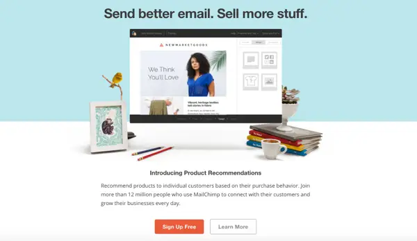
All of this was presented in a whimsical home office environment with a hero image. The appearance and feel of the website were okay. The page was responsive and well-structured as it was, but that doesn’t mean it couldn’t be better. The company wanted to provide a better experience to users. Hence, they decided to redesign the website.
To meet their customers’ needs, the company decided to implement a new brand identity and design system.
In the new design, you can observe an updated logo, color palette, typeface, unique imagery, and illustrations on the website. Moreover, they have changed the font to sans serif and changed the c to lower case in the Mailchimp logo. Further, the Mailchimp design introduced 4 main features with the sketch illustration.

The primary purpose behind the redesign is to provide consistency on desktops and smartphones.
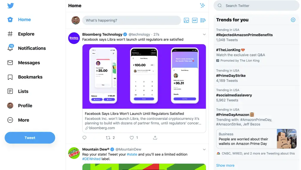
There are some crucial changes if we consider the before and after website design. Here, Twitter has removed the top navigation bar and shifted the entire menu on the left-hand side.
Also, they have introduced two essential functions, bookmarks & lists that were hidden inside the website.
On the right-hand side panel, you can see the trends running around the world. After which, you can view persons you can follow.
Also, Twitter has introduced an inbox like direct messages, where you can check and respond to the messages instantly.
For people who love personalization, Twitter introduced light and dark modes.

It is one of the best website redesigns on our list. After the redesign, there was a lot of talk happening about the new design in the technology world.
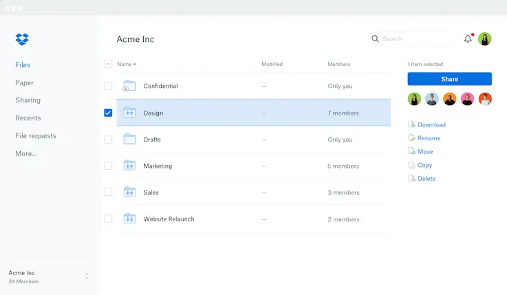
The main reason why Dropbox redesigned its website is that its goal evolved from storing files to assisting the team in synchronization.
With the new design, the company wants to showcase to its users that Dropbox is not just keeping files but also helps in collaborating teams and ideas.
However, with the redesign, Dropbox provides a thumbnail view so that you can visually browse all the files. Also, it allows you to check people collaborating with you on shared files and folders.
Besides this, Dropbox has integrated an enhanced search to find Dropbox Paper documents and users’ files. It allows users to switch between personal and work accounts effectively.
Apart from these changes, Dropbox has made some other necessary changes in the redesign.
For businesses that want to incorporate custom features or upgrade their website’s backend during redesign, our web development service can help build powerful, secure, and user-friendly functionality.


With the new design, slack offered a quick navigation bar with options like why slack, pricing, find your workspace, create workspace, and about us. Slack has made finding things on the website quick for users.
Moreover, it now enables businesses to communicate well with customers about comments & queries by setting up a few things.
We have shared with you the 5 most popular website redesign examples. Apart from this, various other well-known companies have done website redesign.
With the website redesign, companies offered an enhanced experience to users and achieved their business goals.
If you own a website and are unable to achieve your business goals for a long time, you should think of a website redesign.
For redesigning your website, you can either choose a ready-made template or build your website from scratch. To know more, check this guide on template vs the custom-built website.
If you want to redesign your website, it is recommended to approach a website design and development company. They have years of experience and have designed websites for different industries.
WebyKing is a professional website design and development company. We provide excellent website redesign services for startups and businesses. Hence, you can share your website issues with us, and we can provide you with a free quote.
Here is the streamlined process to follow to redesign an existing website.
A website redesign is a long process that consists of changing some of the most essential elements in the website, such as visuals, design, content, code, and architecture to fulfill the audience’s needs. The core purpose behind website redesign is to reduce bound rates, increase revenue, and provide a best-in-class experience to users.
Typically, you should redesign your website every 2 to 3 years. A website that has not been updated for three years is considered outdated. Based on the business goals of your website and current design trends, you should redesign your website.
Ravi Makhija, the visionary Founder and CEO of WebyKing, is a seasoned digital marketing strategist and web technology expert with over a decade of experience. Under his leadership, WebyKing has evolved into a premier full service web and marketing agency, delivering innovative solutions that drive online success. Ravi’s deep understanding of the digital landscape combined with his passion for cutting-edge technologies empowers him to consistently exceed client expectations and deliver results that matter.

Let’s turn your ideas into impact—reach out and let’s build something exceptional together.
Customer
Retention Ratio
Certified Professionals
Projects
Years of Experience


TRUSTED BY 100+ CLIENTS, WITH OVER 100 PROJECTS SUCCESSFULLY DELIVERED AS A FULL-SERVICE WEB AGENCY
TRUSTED BY 100+ CLIENTS, WITH OVER 100 PROJECTS SUCCESSFULLY DELIVERED AS A FULL-SERVICE WEB AGENCY
TRUSTED BY 100+ CLIENTS, WITH OVER 100 PROJECTS SUCCESSFULLY DELIVERED AS A FULL-SERVICE WEB AGENCY
Web Design By Industry
Digital Marketing
eCommerce Web Design
SEO Services
Lead Gen By Industry
Migration By Platform
PPC By Industry
Maintenance By Platform
Our Presence
Expand your business digitally on a global scale! We’re always ready at your service, with dedicated teams in three key international locations.
5354 Denny Ave, North Hollywood, Los Angeles, CA 91601, United States.
9720 Jones Rd, S210, Houston, TX 77065, United States.
The Spire, Office No: 312, Near Ayodhya Chowk BRTS Bus Stop, 150 Feet Ring Road, Rajkot
Share your details below and we’ll get back to you soon.
We’ll get back to you shortly.


")
