Last Updated: August 10, 2026
Reading Time: 13 minutes
Post Views: 2,651
Great travel website design doesn’t just showcase destinations – it turns inspiration into action. With clear navigation, compelling visuals, and a frictionless user journey, the best travel websites help visitors move from thinking about a trip to booking one.
This guide breaks down 25 of the best travel and tourism Website Design examples for 2026 – spanning travel agencies, tour operators, online travel agencies (OTAs), luxury brands, tourism boards, and travel blogs.
For each one, you’ll see the specific design decision that works, why it works, and what you can borrow for your own site. You’ll also get an original scoring framework, current industry statistics, and a practical checklist for planning your own travel website.
What Makes a Travel Website Design Effective?
A great travel website combines inspiring visuals with an easy booking journey. It helps users explore destinations, compare options, trust the brand, and complete a booking without friction.
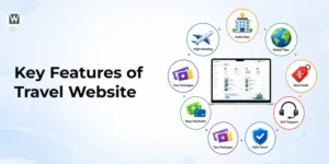
Key elements of successful travel website design include:
- Strong visuals that inspire people to travel
- Clear navigation that makes the site easy to use
- Fast, mobile-friendly browsing
- Clear booking and enquiry buttons
- Trust signals such as reviews, ratings, and certifications
- Relevant content and personalised recommendations
- Consistent branding across the website
The best travel websites balance inspiration, usability, and conversion to turn visitors into customers.
Types of Travel Websites (and How Design Differs by Type)
Not all travel websites are built the same. The right design depends on your business model and what the visitor is trying to do. Here are the most common types.
1. Travel Agency Websites
Focused on booking flights, hotels, tours, or vacation packages. They typically include a booking engine, itinerary tools, and enquiry forms.
2. Tour Operator Websites
Built to sell specific tours or experiences (safaris, city tours, adventure trips). They lean on rich visuals, detailed itineraries, and clear booking CTAs.
3. Online travel agencies (OTAs) / marketplaces.
Platforms where users compare and book across many providers (Expedia, Booking.com). Content-heavy and driven by filters, search, and integrations.
4. Hotel & Resort Websites
Showcase accommodation with high-quality imagery, room detail, rates, and a direct booking system.
5. Travel blog / influencer websites
Storytelling-first: guides, tips, and personal experiences, with strong blog layouts, social integration, and newsletter capture.
6. Tourism board / destination (DMO) websites
Created by tourism boards to promote a place — attractions, events, culture, and itineraries. Built for inspiration and planning.
7. Travel gear / accessory shops
E-commerce sites selling luggage, gear, or digital guides, where clean product layouts and smooth checkout matter most.
25 Best Travel Website Design Examples
Here are 25 real-world travel websites — from global OTAs to solo travel blogs — that combine form and function. Scan the comparison table first, then dive into the analysis.
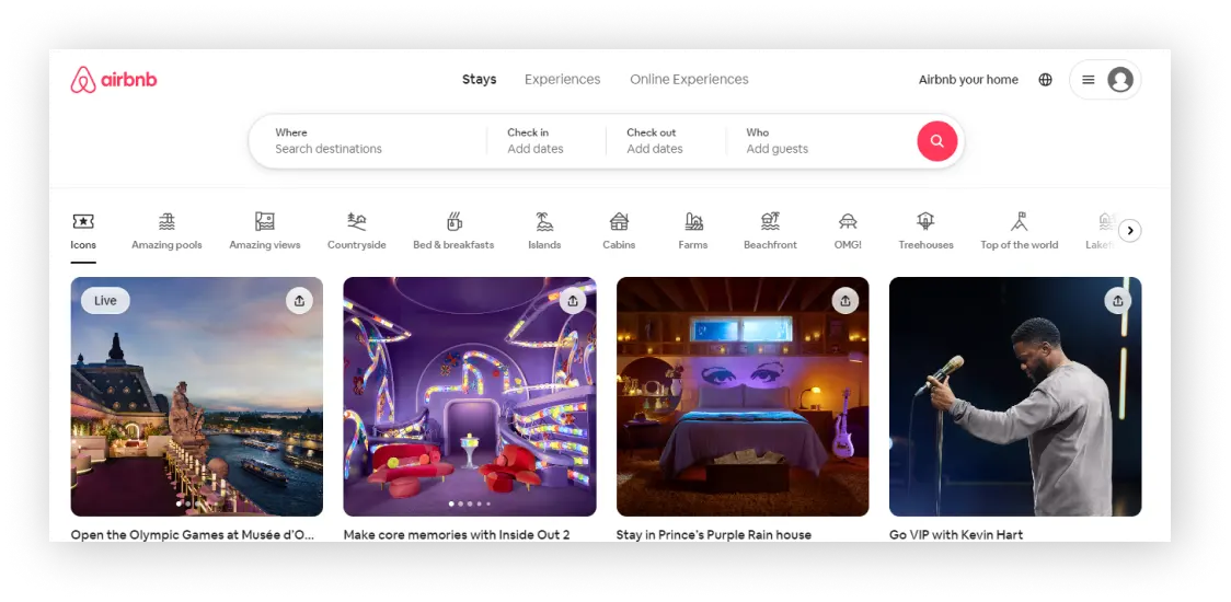
Airbnb’s website effortlessly guides users from dream to booking. The homepage is clean, elegant, and vibrant, with a prominent search box front and center.
Listings and navigation are easy to find, social media links are included, and the footer contains relevant site information. The accessibility page features engaging visuals, a strong call to action, and ample white space for readability.
Special Features:
- Search options for stays and activity planning
- Different property types available
- Language preferences
- Accommodation Options
- Visible CTA
- Detailed booking info
- Compelling social proof
- Visually appealing images
- Informative price chart
Best For: Businesses building a modern booking marketplace with high-impact visuals and strong UX flow.
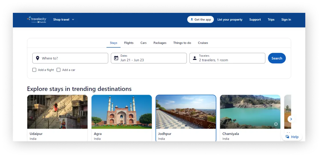
Travelocity’s website provides a user-friendly experience for travelers looking to book flights, hotels, and vacation packages. The homepage features a streamlined design with a prominent search bar, making it easy to find and compare options.
Users can access various travel deals, read customer reviews, and utilize trip planning tools. The site also offers comprehensive customer support and flexible booking options to enhance the overall travel planning process.
Special Features:
- App download option is also available.
- Comprehensive customer support
- Easy account creation
Best For: Travel companies needing a comparison-first design with clear filters and easy price navigation.
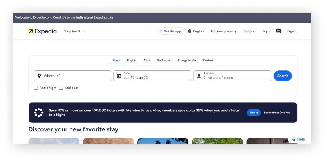
Expedia is a user-friendly travel website where you can easily navigate between stays, flights, cars, and more. It remembers your searches and auto-populates them for quick access. Additionally, it highlights last-minute weekend deals as you scroll down.
This website is similar to Travelocity in its user-friendly approach to travel planning and comprehensive booking options.
Special Features:
- Offering stay options with authentic photos.
- Featuring trending destinations
- Flexible booking option is also available
Best For: Enterprises offering multiple travel services and requiring a scalable, all-in-one booking interface.
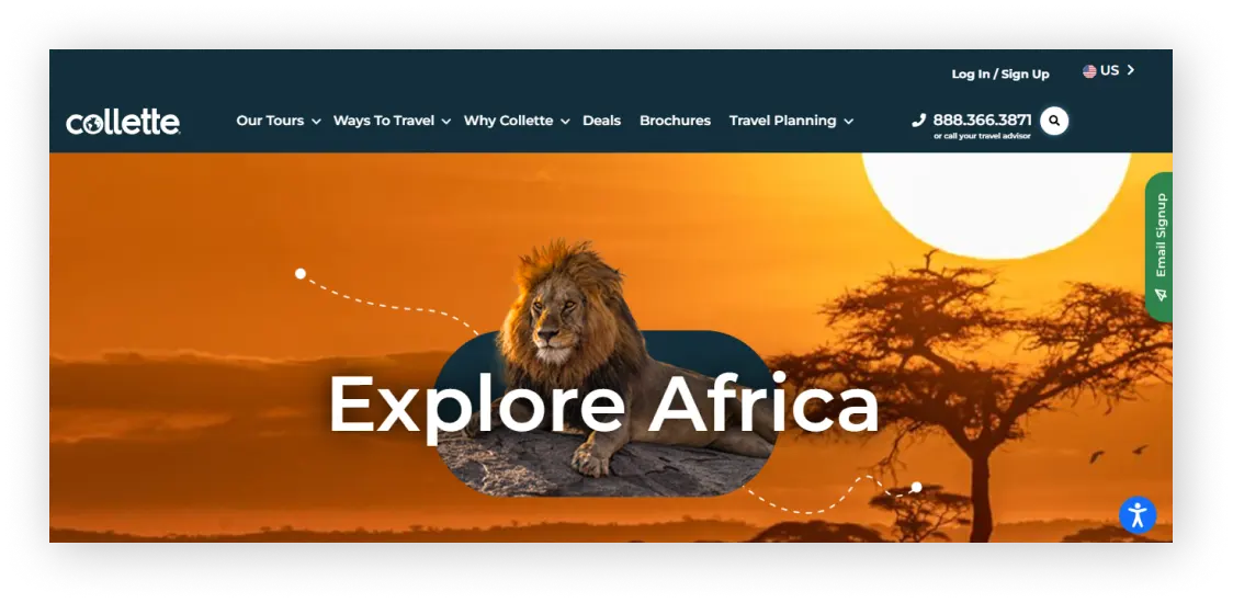
Gocollete’s web design stands out with a sleek and modern interface aimed at elevating user experience. The homepage features an eye-catching lion image that captures attention. It provides easy ways to choose a location, date range, and travel style, making booking simpler.
Special Features:
- Integrated Instagram feeds provide vibrant travel inspiration directly on the site.
- Users who need help can easily reach out to a contact number provided on the navigation
- Clear call to action
Best For: Tour providers looking for an itinerary-driven layout with organised package categorisation.
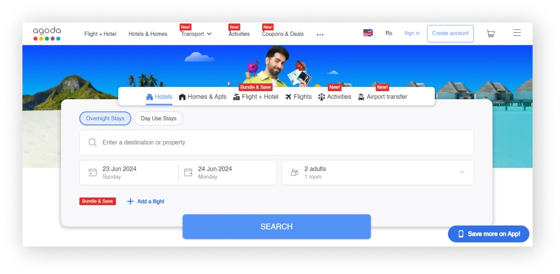
Agoda is an award-winning travel booking website known for its global accommodation options. With easy navigation and detailed search filters, customers can quickly book their preferred stays.
Customer reviews offer helpful insights for future travellers, making Agoda a prime example of a user-friendly design that enhances the booking experience.
It’s one of the best travel site design options for hotels.
Special Features:
- Agoda features Ayushmann Khurrana (Indian actor and singer) as their brand ambassador, leveraging his versatile persona to connect with a diverse audience.
- The website provides a clear option to download the app, giving a 10% discount for bookings made using the app
- The coupons and offers page is also available
Best For: Hospitality platforms focused on mobile-first design and dynamic, deal-driven pricing.
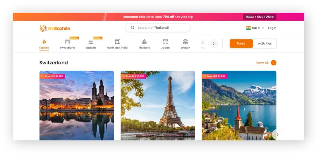
Thrillophilia is an adventure travel platform that showcases thrilling experiences worldwide. Its website design reflects this adventurous spirit with vibrant colours, playful animations, and captivating graphics, creating an exciting user experience.
Thrillophilia serves as a fantastic source of design inspiration for travel websites looking to appeal to adrenaline-seekers!
Special Features:
- They offer many travel packages for different countries. These include Switzerland, Thailand, Japan, and others. They ensure visitors can easily find and book their ideal trips.
- Option to view prices in different currencies, catering to international travellers’ preferences
Programming Languages Used: Node.js
Best For: Adventure and experience brands needing an activity-focused layout with strong visuals.
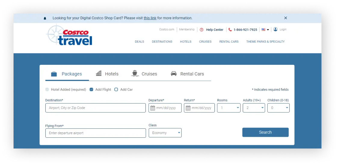
Costco Travel proves that effective travel website design doesn’t always require flashy visuals. Despite its simple appearance, it offers a seamless user experience with detailed options for trip planning.
Special Features:
- Have a separate section for Travel Items
- Rewards section given on travel booking
Best For: Membership-based businesses offering bundled packages and exclusive travel deals.
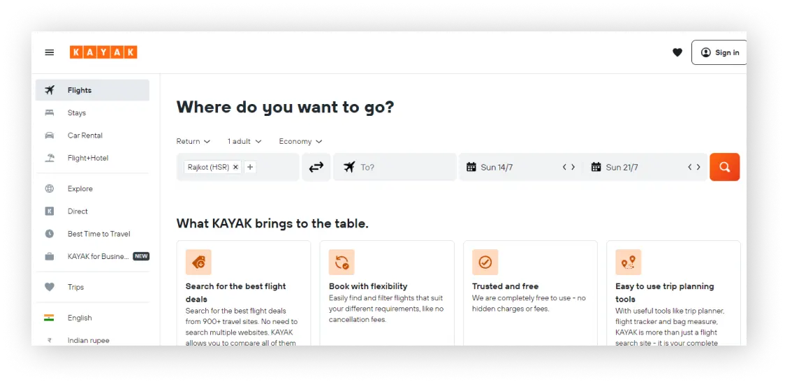
When you visit Kayak’s website, the vertical menu catches your eye right away. It sets Kayak apart from travel sites that use horizontal navigation. This feature makes it easy to navigate to any page you need, and it stays accessible as you scroll through the site.
Special Features:
- Utilising a travel planning tool powered by ChatGPT.
- A separate page is provided for business travellers who frequently travel for work.
Best For: Metasearch platforms requiring robust search features and advanced comparison functionality.
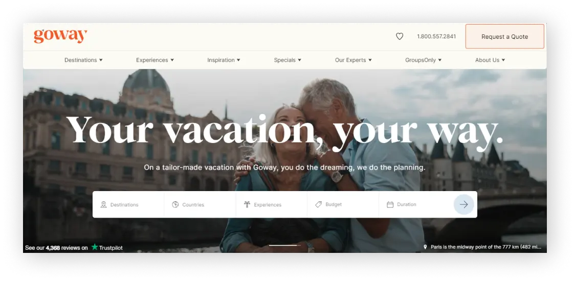
Goway’s latest website showcases a cutting-edge layout that revolutionises personalised travel.
Special Features:
- The website’s design features a variety of trip styles tailored to match individual tastes and hobbies
- The website features reviews from travel experts in a visually appealing card format with vector graphics
- Placed trending travel blogs to inspire your next journey
- The web design includes a live chat feature for instant support
Best For: Niche travel companies offering tailor-made luxury or long-haul travel planning.
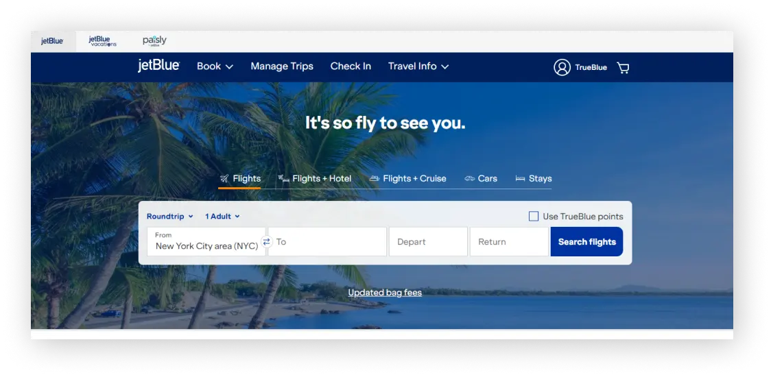
JetBlue’s website is easy to use and nice to look at. It also shows the airline’s commitment to innovation and customer-focused service. The vibrant design and intuitive interface reinforce JetBlue’s modern and creative brand identity.
The website prioritises simplicity and practicality. It ensures a seamless experience for users at every stage of their journey. This focus aligns perfectly with JetBlue’s reputation for providing exceptional travel experiences. High-quality images and a clear layout show the airline’s dedication. They deliver information efficiently and boost passenger satisfaction.
Special Features:
- Route map
- Vacation finder
- Flight tracker
- Travel alerts
Best For: Airlines or transport companies wanting a fast, branded booking interface.
Tell Us About Your Travel Website Needs
Select your goals, describe your challenge, and we’ll take care of the rest.
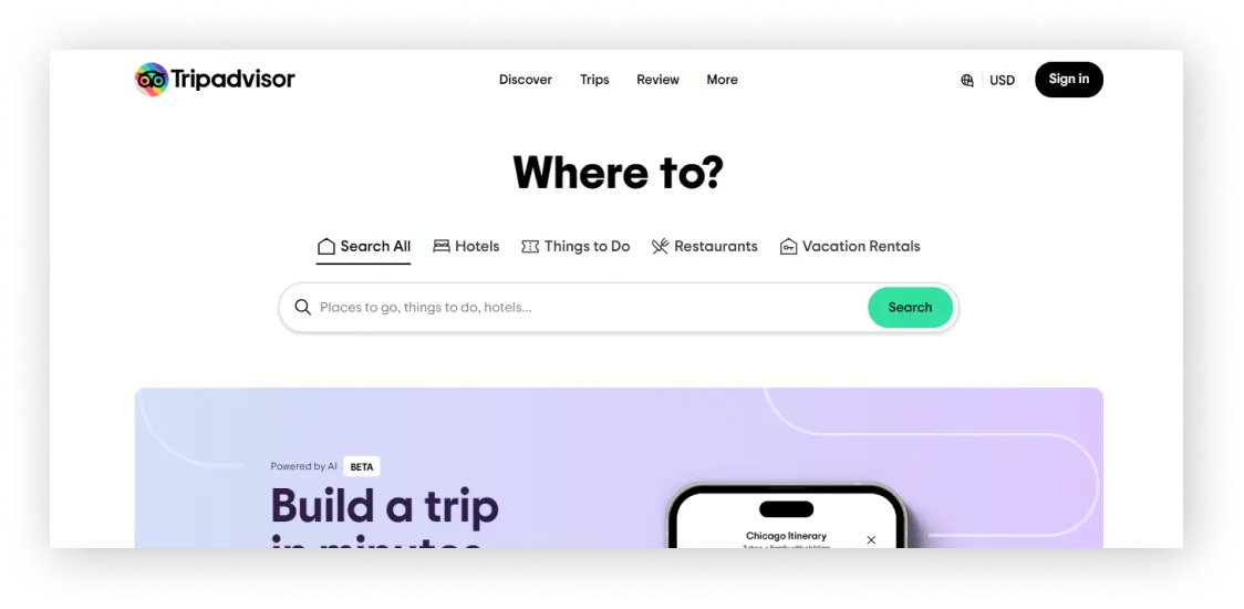
TripAdvisor is a unique travel website that offers a special feature: it uses artificial intelligence (AI) to make personalised travel plans. When you go to the site, you’ll find a helpful tool to help you plan your dream vacation. The top of the page has a simple menu that makes it easy to explore different parts of the website that you might miss otherwise.
One of the top travel website examples for user-generated content.
Special Features:
- Users can upload photos, include new places, and share their reviews
- You can hire a Trip Designer
Best For: Platforms built around reviews, community ratings, and content-rich destination pages.
12. Booking
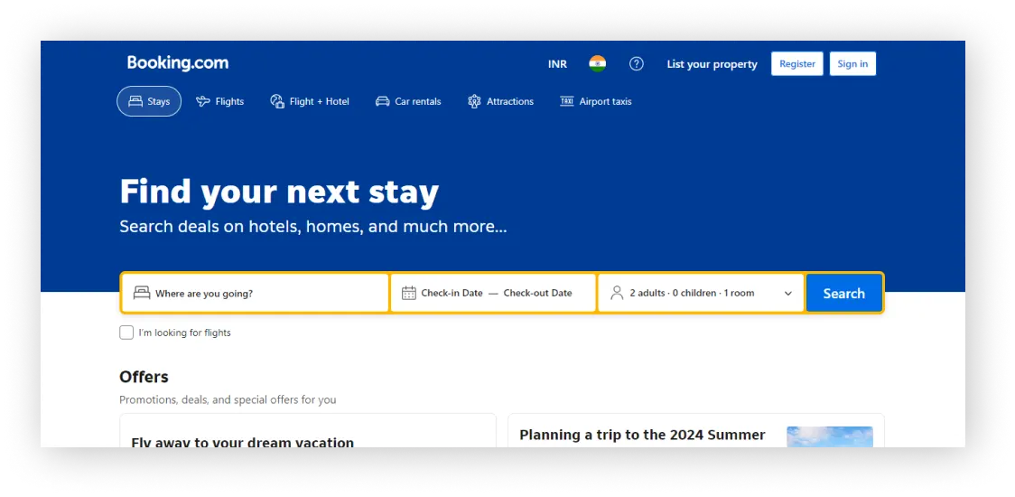
Booking.com’s website stays true to its brand identity with easy navigation and a cohesive font that complements its overall design. The layout is well-organised, making it user-friendly, and allows visitors to effortlessly scroll through trendy destinations.
Special Features:
- Frequently Asked Questions (FAQs) about airport taxi services
- Option to list your property
Best For: High-volume accommodation websites focused on conversion-optimised booking flows.
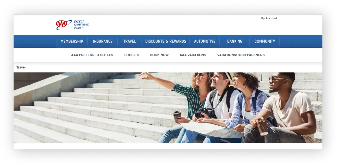
The design allows you to select hotels, flights, cars, and cruises using different filters. It also showcases vacation partners, hotel partners, and cruise partners to build trust in their services.
Special Features:
- There is a dedicated page for booking rental cars, which comes with many advantages.
- It provides access to a wealth of travel information
- The platform features three distinct websites for various travel booking needs: “Trip Canvas,” “TourBookers to navigate. The use of icons helps visitors move around the menu effortlessly. The men,” and “TripTik.”
Best For: Multi-service travel agencies needing a clean, trust-oriented layout.
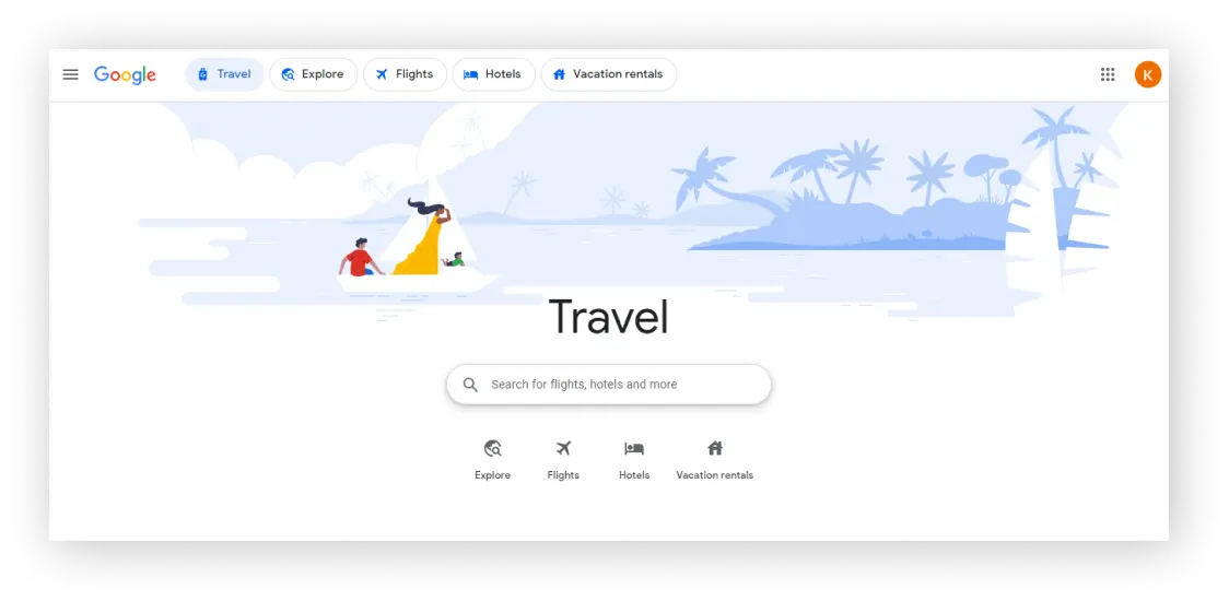
Google Travel is an example of exemplary travel website design. It features plenty of white space, making it easy for user engagement. Menu placement is also unique, making it stand out.
Special Features:
- Minimalist design
- A smooth and efficient user experience
- Gives flight alerts when prices drop
Best For: Platforms wanting a data-driven interface with smart price tracking and destination insights.
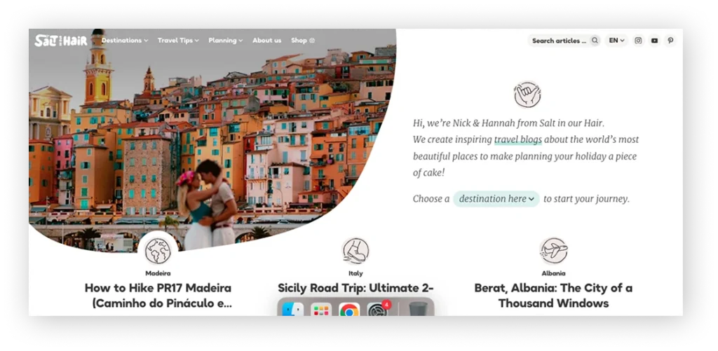
Salt in Our Hair stands out as one of those travel blogs you can scroll through for hours. Its soft pastel tones, minimalist layout, and easy navigation make it feel calm and inspiring. Whether you’re searching for destination guides, travel tips, or dreamy photo stories, this site delivers it all in a way that feels welcoming—especially on mobile.
Special Features:
- Eye-catching grid-based layout for blog posts
- Built-in affiliate tools and booking links
- SEO-optimized travel guides
- Mobile-friendly navigation
Best For: Travel blogs and content creators requiring visually rich storytelling and SEO-friendly layouts.
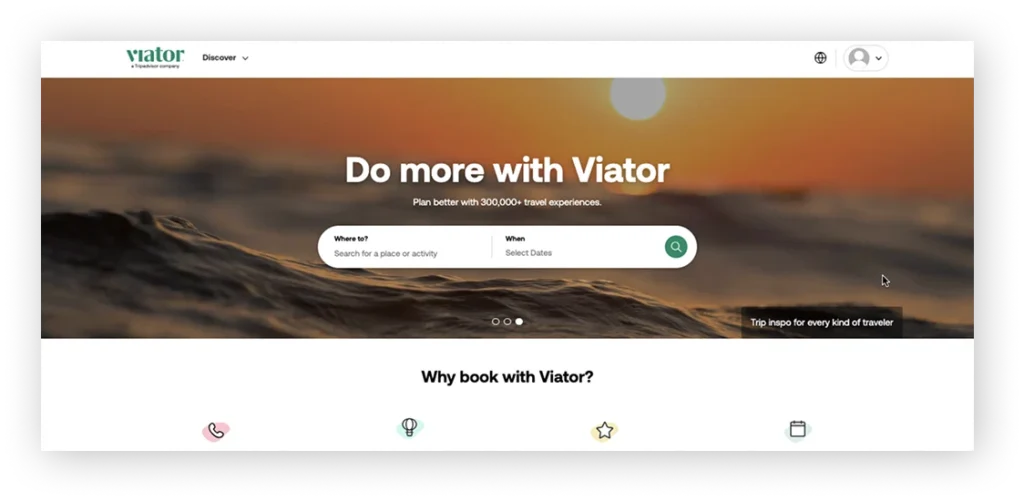
Viator offers a sleek and efficient travel experience, helping users discover and book tours and activities across the globe. The design is user-friendly, with intuitive filters and vibrant visuals that make exploring local experiences feel effortless. From last-minute adventures to curated tours, the platform makes planning smoother.
Special Features:
- Smart search filters by destination, category, and rating
- Rich visuals and user reviews for each experience
- Mobile-first booking interface
- “Reserve Now & Pay Later” option
Best For: Tour and activity platforms needing a simple list-based structure with strong CTAs.
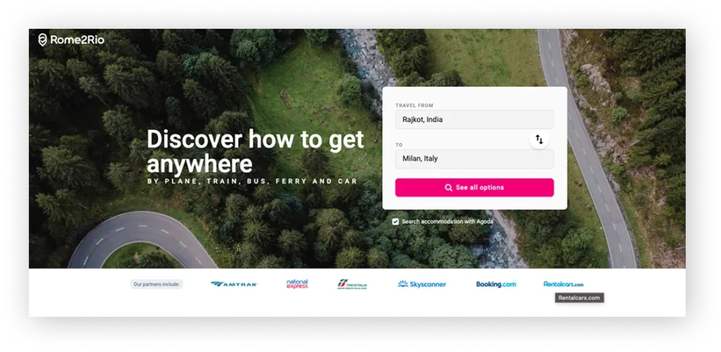
Rome2Rio takes a practical approach to travel planning, helping users figure out how to get from point A to B anywhere in the world. The clean layout and map-driven design make it easy to compare flights, buses, trains, and driving routes — all on one page.
Special Features:
- Multi-modal transport comparison (air, rail, road, ferry)
- Interactive maps and estimated travel time
- Booking links integrated with route results
- Simple, fast-loading interface for on-the-go use
Best For: Transport aggregators offering multi-mode route comparisons with maps and clear connections.
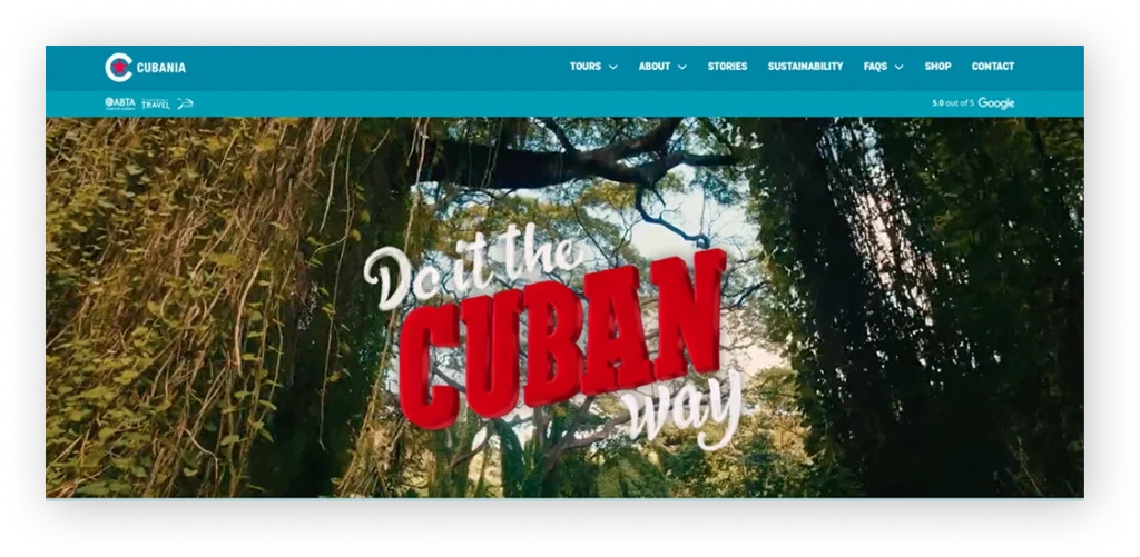
Cubania Travel’s website combines vibrant visuals with a strong focus on immersive, sustainable travel experiences in Cuba. The bold imagery and storytelling create a personal feel, while the design keeps things streamlined for users looking to book group or custom tours.
Special Features:
- Itinerary previews with photo-driven storytelling
- Emphasis on responsible and active travel
- Detailed tour breakdowns with inquiry forms
- Visual consistency with Cuban culture and branding
Best For: Destination-focused agencies showcasing cultural experiences and curated trips.
Get Your Travel Web Designs Examples PDF Free
We have curated a list of top travel web designs just for you. Download Travel Website Design Examples PDF for FREE!
Enter your email to get your Free Travel Website Design Examples PDF now

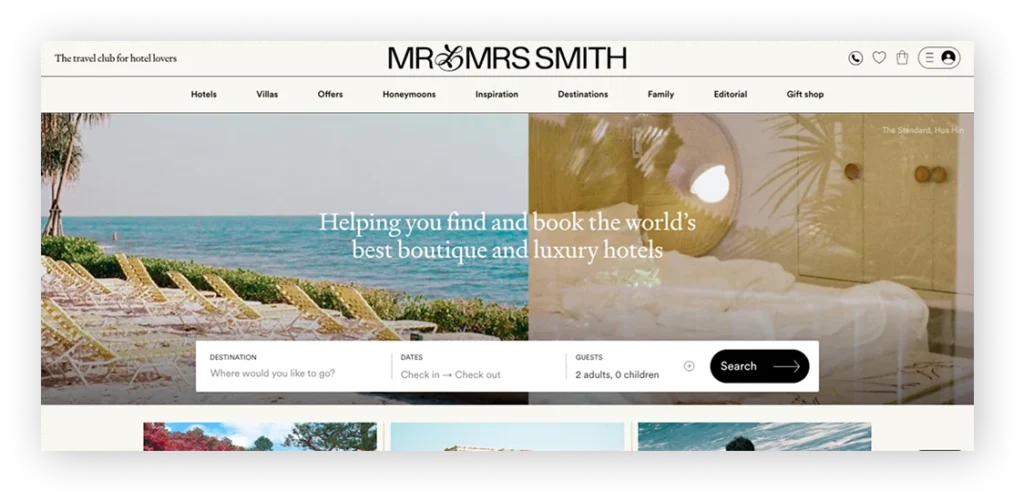
Mr and Mrs Smith is a luxury travel site with a polished, editorial-style design that feels more like a premium lifestyle magazine than a booking platform. It’s tailored for users looking for handpicked boutique stays with flair, comfort, and exclusivity.
Special Features:
- Curated collection of boutique hotels worldwide
- Member-only offers and concierge service
- Large, editorial-style imagery and reviews
- “Smith Extra” perks with every booking
Best For: Luxury boutique travel brands aiming for a premium editorial look.
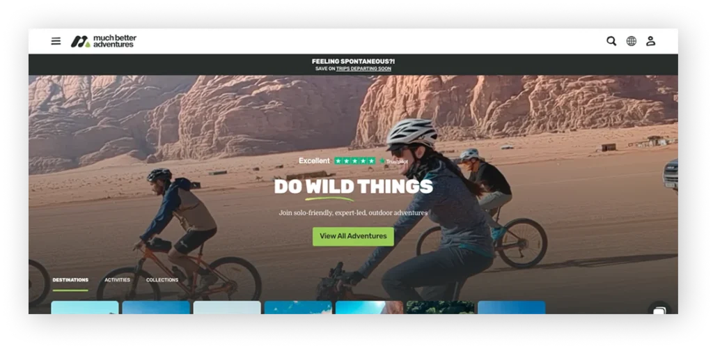
Much Better Adventures delivers a bold, modern feel tailored for adventure seekers. The layout is clean and action-oriented, while trip pages are rich with storytelling, visuals, and eco-conscious messaging. It balances functionality with visual impact perfectly.
Special Features:
- Filter trips by adventure type and destination
- Sustainability badges and carbon data for trips
- Sticky navigation and clean booking CTAs
- Reviews in modern card layout for quick scanning
Best For: Sustainable adventure companies promoting small-group, eco-friendly trips.
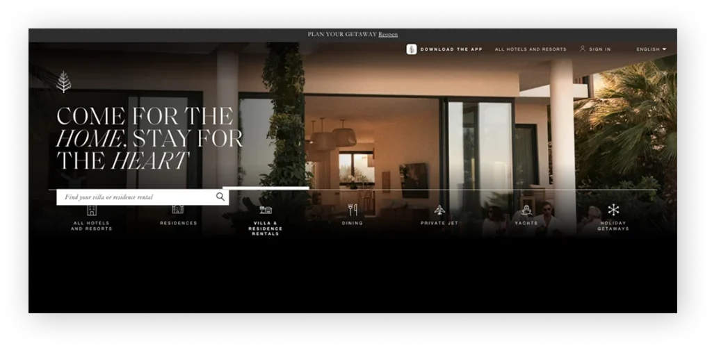
The Four Seasons website reflects elegance and simplicity, matching the luxury it represents. With immersive imagery, smooth scrolling, and personalised touches, it provides a seamless experience for guests booking high-end stays and experiences worldwide.
Special Features:
- Location-based browsing and personalised offers
- High-resolution images and smooth transitions
- Integrated spa, dining, and event booking
- Mobile-optimised experience for travellers on the go
Best For: Luxury hotel chains needing a high-end visual experience with premium branding.
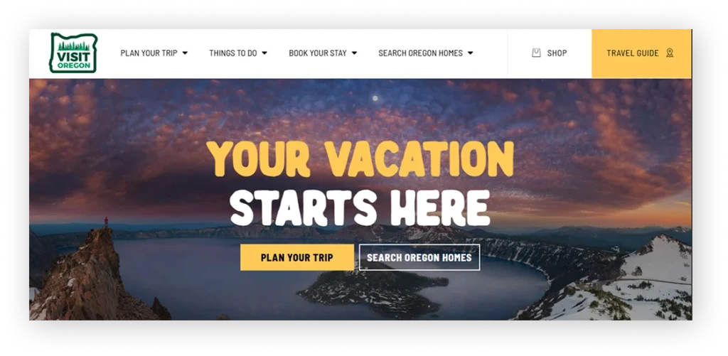
Visit Oregon’s website beautifully captures the state’s scenic charm through immersive visuals and intuitive navigation. The homepage greets users with breathtaking landscapes, inspiring them to explore destinations, plan itineraries, and discover local experiences seamlessly.
Special Features:
- Interactive trip planner with map integration
- Seasonal travel ideas and local event highlights
- High-quality imagery showcasing Oregon’s natural beauty
- Easy access to regional travel resources
Best For: Tourism boards building destination guides with itineraries and interactive maps.
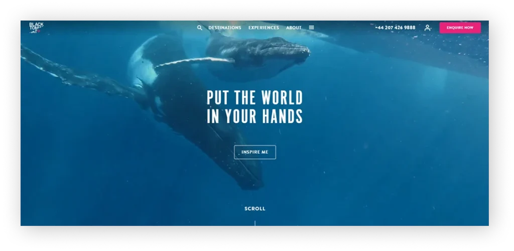
Black Tomato’s website exudes luxury and exclusivity, appealing to travellers seeking personalised, high-end experiences. The minimalist design uses full-screen visuals and elegant typography to convey sophistication while maintaining a simple, easy-to-navigate structure.
Special Features:
- Curated, tailor-made travel experiences
- Immersive imagery and video storytelling
- Clean, editorial-style design layout
- “Get Inspired” section for destination ideas
Best For: Custom travel designers focusing on storytelling and cinematic presentation.
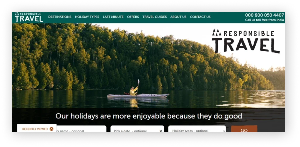
Responsible Travel’s website stands out for its eco-conscious design and focus on sustainable tourism. The interface balances inspiring visuals with clear messaging on ethical travel, enabling travellers to make meaningful choices through responsible adventures.
Special Features:
- Sustainability-focused content and transparency on carbon impact
- Easy search by destination or travel type
- Traveller reviews emphasising authenticity and experience
- Detailed ethical travel guides and stories
Best For: Eco-tourism companies emphasising ethical travel and sustainability messaging.
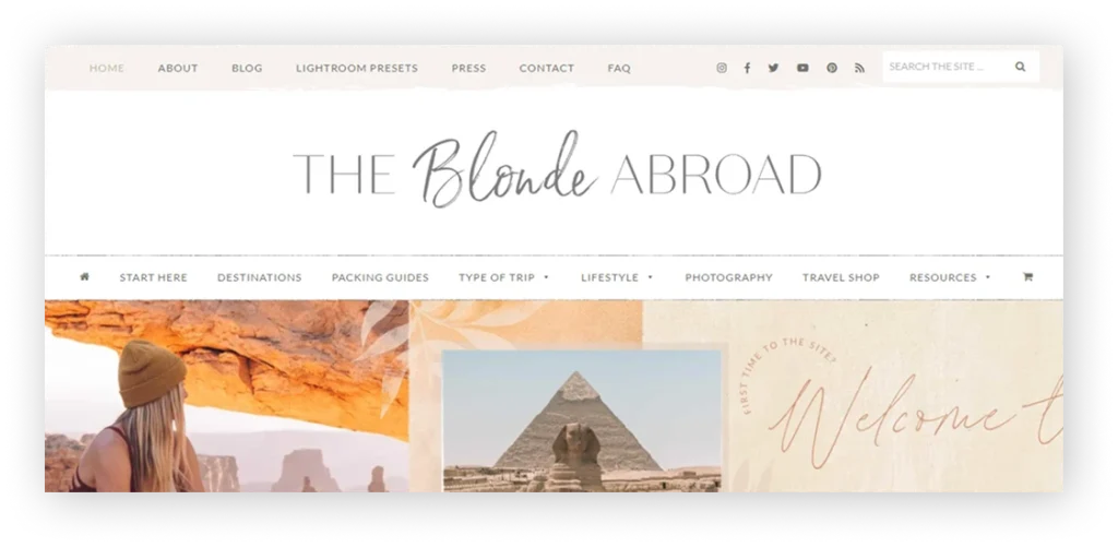
The Blonde Abroad blends travel inspiration with personal storytelling, offering a visually engaging experience for solo and female travellers. Its soft colour palette, high-quality photography, and blog-style layout create a warm, welcoming vibe that keeps visitors exploring.
Special Features:
- Organised travel guides by country and theme
- Integrated shop and resource pages
- Inspiring photography with storytelling captions
- User-friendly design optimised for mobile browsing
Best For: Influencer-driven brands with a strong focus on content, guides, and visual identity.
Your website is a crucial component in attracting more travellers to your tourist destination. When people research potential travel spots, they check out websites to determine if a place fits their needs. Investing in travel web design is essential to deliver the best experience for your audience.
Key Takeaways: Travel Website Design Examples
- The best travel websites combine visual storytelling with clear user journeys to inspire and convert visitors.
- Strong first impressions matter—high-quality visuals and clear messaging capture attention instantly.
- User experience drives bookings, with simple navigation and fast, mobile-friendly design.
- Trust elements like reviews, pricing clarity, and real experiences play a key role in decision-making.
- Effective websites guide users toward action with clear CTAs and seamless booking paths.
- Great design is not just about looks—it’s about turning visitors into travelers and leads.
Conclusion
The best travel website designs do more than show beautiful destinations. They create a smooth user experience that builds trust and encourages bookings. From storytelling-led travel brands to booking-focused platforms, each example in this guide shows how smart design choices can improve engagement, strengthen credibility, and support business growth.
Whether you are planning a travel agency website, redesigning a tour operator platform, or launching a travel startup, studying successful travel website examples can help you understand what works. The goal is not to copy these websites, but to learn why their design choices are effective and how they support business goals.
As traveller expectations continue to change, travel businesses that invest in user-friendly, mobile-responsive, and conversion-focused website design will be better positioned to attract visitors, generate leads, and increase bookings.
Frequently Asked Questions
What makes a travel website design effective?
A travel website design is effective when it combines strong visuals, clear navigation, and a simple path to inquiry or booking. The best examples help users explore destinations, compare options, and take action without friction.
What should I look for in travel website design examples?
Look for layout structure, booking flow, trust signals, mobile responsiveness, and how the site presents destinations or packages. These details show whether the design is built only to look attractive or to support leads and bookings.
How do I choose the right design for my travel business?
Choose a design that matches your business model, whether you run a travel agency, tour operator, luxury travel brand, or travel booking platform. The right design should support your audience, services, and conversion goals.
What features should a modern travel website include?
A modern travel website should include destination pages, enquiry or booking forms, reviews, search filters, and mobile-friendly navigation. Depending on the business, it may also need itinerary pages, payment integration, and content marketing sections.
Should I use a template or a custom travel website design?
A template can work for a simple launch, but a custom travel website design is better if you want stronger branding, better user experience, and more bookings. Custom design also gives you more flexibility to match your services and growth plans.
I'm Ravi Makhija, Founder & CEO of WebyKing. I believe your website should be the hardest-working member of your team, building trust, generating leads, and creating opportunities 24/7. Through web design, development, SEO, and digital strategy, I help businesses build websites that become growth assets-not just digital brochures. Too many businesses invest in websites that look great but fail to deliver real business value.
Business owners deserve digital solutions that are simple, practical, and built around their goals, not unnecessary complexity. After all, your website shouldn't just represent your business; it should help grow it.


Need Help Building a High-Performing Travel Website?