


10 Top Responsive Web Design Testing Tools

Top 10 Responsive Web Design Testing Tools

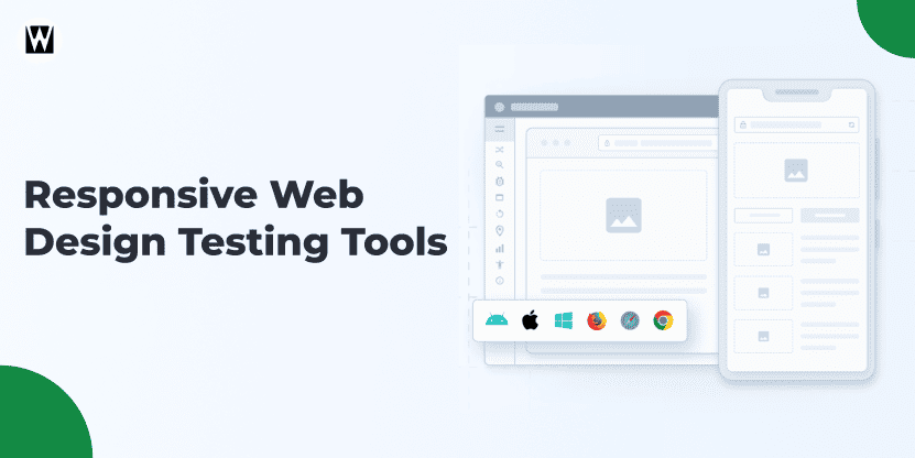
Featured Image of Responsive Web Design Testing Tools
Last Updated: July 29, 2026 Reading Time: 10 minutes

Are you ready to bring your website to LIFE? The secret to making sure that your responsive web design performs without any hitch across different devices is testing. Mobile traffic is surging, and users want a seamless experience, whether they are accessing a smartphone, tablet, or desktop.

When browsing a website on smaller screens, the first thing you want is for your website not to look like a mess. This is where responsive web design testing tools come into play.

In this blog, we will break down the top tools that ease the testing process. Whether you’re checking if your site is up to scratch on mobile or adjusting design elements, these responsive web design testing tools will help ensure that your site not only has a great appearance but also works, giving visitors an experience they’ll love. 

Without further ado, let’s look at the best options available so that you can get your site fully optimised and ready to shine across the board.

What Are Responsive Web Design Testing Tools?

Responsive web design testing tools help developers and designers verify that a website displays and functions correctly across different screen sizes, browsers, and devices. They make it easier to identify layout issues, rendering inconsistencies, and usability problems before they affect real users.

These tools can recreate different viewport dimensions, test cross-browser compatibility, preview layouts across devices, and in some cases, automate responsive testing workflows. By testing early and often, teams can deliver a more consistent user experience while reducing design and development issues after launch.

Why Is Responsive Web Design Testing Important?

Responsive testing helps ensure that your website delivers a consistent experience regardless of the device, browser, or screen size being used. A layout that looks perfect on a desktop can break unexpectedly on a smartphone, tablet, or ultrawide display if it is not properly tested.

As websites become more interactive and users access them from a wider range of devices, testing responsiveness is no longer limited to checking a few screen sizes. Modern testing tools help teams validate layouts, navigation, forms, images, and interactive elements before they impact real users.

  • Improves user experience by ensuring content remains easy to read and navigate across devices.
  • Identifies layout issues early before they affect visitors or customers.
  • Supports cross-browser compatibility across Chrome, Safari, Firefox, Edge, and mobile browsers.
  • Validates responsive breakpoints to ensure layouts adapt correctly to different viewport dimensions.
  • Reduces development rework by catching issues during testing rather than after launch.
  • Helps support mobile-first design strategies for growing mobile audiences.
  • Improves website quality and usability across desktops, tablets, and smartphones.
  • Supports SEO performance by providing a better experience for users on all screen sizes.

When testing responsive websites, it is important to go beyond simple resizing. Teams often need to verify browser rendering, touch interactions, navigation behaviour, image scaling, form functionality, and performance under different device conditions. The right responsive testing tool makes this process faster, more accurate, and easier to manage.

10 Best Tools for Responsive Web Design Testing

When it comes to responsive web design, testing is a crucial step to ensure that your website delivers a seamless experience across all devices.

Thankfully, there are a variety of tools designed specifically for testing responsiveness, helping you identify any issues and fix them before they impact your users. These tools not only ensure compatibility across devices but also highlight the benefits of responsive design, such as improved user experience and better SEO performance.

Below are the top 10 responsive web design testing tools that every designer should consider.

top-responsive-web-design-testing-tools
Rating: ⭐⭐⭐⭐⭐ (5/5)

BrowserStack is one of the best, widely used, cloud-based responsive web design testing tools used by 25,000+ companies across the world. It lets you test your website on a wide range of browsers and devices.

From desktop browsers (Windows and Mac) to mobile (with Android and iOS), BrowserStack does it all. Gaining access to over 2,000 real devices, the platform aids in confirming that your site is running smoothly across different OS, screen sizes, and device configurations.

It is integrable with the continuous integration workflow, thereby catching the fancy of developers and optimizers wanting acceleration in the process of testing to speed up the website. What sets BrowserStack apart is its real-time testing, enabling you to interact directly with the website on a specific device.

Features:

  1. Trusted by 25000+ customers globally 
  2. Tests across 2,000+ real browsers and devices
  3. Real-time interactive testing on Android, iOS, Windows, and Mac
  4. Automated testing with integration for continuous delivery
  5. Supports modern and legacy browsers
  6. Easy-to-use interface with minimal setup required
Rating: ⭐⭐⭐⭐★ (4/5)

Google’s Mobile-Friendly Test is a simple and free tool that provides quick insights into how mobile-friendly your website is. Simply enter your URL, and Google will evaluate your website and give you a score based on how well it performs on mobile devices.  

The tool is especially important for SEO because Google prioritises mobile-friendly sites in its search rankings. With over 50% of global web traffic now coming from mobile devices, using this tool ensures your website is optimised for the modern, mobile-first web. 

Features:

  1. Free to use with instant results 
  2. Quick insights into mobile-friendliness
  3. Provides actionable recommendations for improvements 
  4. Mobile compatibility test powered by Google
  5. Direct integration with Google Search Console

3. Responsinator

Rating: ⭐⭐⭐⭐★ (4/5)

Responsinator is a fast and simple tool for testing how your website looks across various devices. By entering your site’s URL, you can instantly view how it appears on a wide range of devices, including smartphones, tablets, and desktops. 

This free tool makes it easy for designers and developers to check if their website design adapts well to different screen sizes, which is key to providing a responsive experience. 

While Responsinator doesn’t offer in-depth analysis or testing, it’s a great starting point to visually confirm that your site is displayed correctly on popular devices like the iPhone, iPad, and Android smartphones. For anyone looking for a quick, no-cost solution, this tool delivers just enough information to catch glaring issues without requiring any setup or complex features.

Features:

  1. Free and easy-to-use tool 
  2. Visual representation of your site on various devices
  3. Fast, no setup required
  4. Covers popular devices like iPhone, iPad, and Android smartphones
  5. Simple interface for quick checks
Rating: ⭐⭐⭐⭐★ (4.5/5)

CrossBrowserTesting is a comprehensive platform that lets you test your website across different browsers, devices, and operating systems. With access to over 1,500 real desktops and mobile browsers, you can perform both manual and automated tests to ensure your website performs seamlessly across various environments. 

For developers working with a global audience, CrossBrowserTesting also offers geolocation-based testing, ensuring your site performs well in different regions. It’s an excellent tool for a larger website or teams that require in-depth testing on a variety of browsers and devices. 

Features:

  1. Test on over 1,500 real devices and browsers 
  2. Manual and automated testing options
  3. Real-time live testing with interaction
  4. Supports geolocation-based testing
  5. Screenshot and video recording features for easy bug reporting

5. Responsive Design Checker

Rating: ⭐⭐⭐⭐★ (4/5)

Responsive Design Checker is an intuitive, free tool that allows you to view how your website looks across different screen sizes. Simply input your URL, and the tool will show how your site appears on several common devices, from smartphones to tablets and desktops. 

It’s a great tool for designers looking for a quick check to ensure their layouts are responsive without diving deep into complex testing scenarios. 

While the tool doesn’t offer detailed analysis, it’s perfect for quickly visualising how well your site adapts to different screen sizes. It’s ideal for designers or developers who need a straightforward, no-fuss way to confirm that their design is scaling correctly across popular devices. 

Features:

  1. Free and easy-to-use 
  2. Supports multiple screen sizes and devices
  3. No setup required, just input your URL
  4. Quick visual representation of your site’s responsiveness
  5. Simple and effective for basic design checks
Rating: ⭐⭐⭐⭐⭐ (5/5)

TestComplete is an advanced automated testing platform that goes beyond just checking the visual aspects of responsive design. It allows developers to conduct in-depth functional, regression and performance tests on their websites. 

The tool’s automated testing capabilities make it especially powerful for teams that need to run repeated tests across multiple environments. 

TestComplete’s detailed reporting system also makes it easy to identify issues quickly and ensure that your website is responsive, accessible, and fully optimized for all users. While it’s a premium tool, its rich features and integration capabilities make it a great choice for larger organizations or teams working on high-performance, highly interactive websites. 

Features:

  1. Automated testing for efficiency 
  2. Supports functional, regression, and performance testing
  3. Cross-browser and cross-device support
  4. Detailed reporting and analytics
  5. Integrations with CI/CD tools for continuous delivery
Rating: ⭐⭐⭐⭐⭐ (5/5)

Lambda Test is an innovative cloud-based testing platform that provides a comprehensive suite of testing tools to check the responsiveness of the website across more than 2,000 real devices and browsers. 

It’s designed to help developers test how their website performs on both desktop and mobile devices in real-time, ensuring that all interactive elements work as expected across various screen sizes. Lambda Test is also known for its seamless integration with popular CI/CD tools like Jenkins, CirceCI, and Travis CI, making it a top choice for teams focused on agile development processes. 

With LambdaTest, you can also test websites across different network conditions to simulate slow or unstable connections. 

Features:

  1. Over 2,000 real browsers and devices for testing 
  2. Real-time browser and device testing
  3. Integration with CI/CD tools like Jenkins and CircleCI 
  4. Automated screenshots and video recording features
  5. Network speed simulation for testing in different conditions 
  6. Cross-browser compatibility checks
Rating: ⭐⭐⭐⭐⭐ (5/5)

Polypane is a premium browser built specifically for responsive web development and testing. Along with responsive testing features, it includes multi-screen previews, accessibility checks, metadata verification, and advanced inspection tools within a single workspace.

Instead of switching between devices or constantly resizing browser windows, developers can view multiple screen sizes simultaneously within a single workspace.

What makes Polypane stand out is its synchronised viewport system. When you scroll, click, type, or interact with a page in one viewport, the same action is mirrored across all screen sizes. This makes it much easier to validate layout breakpoints, navigation behaviour, forms, and responsive components across devices simultaneously.

Beyond responsive testing, Polypane includes built-in accessibility and performance auditing tools. It can help identify WCAG compliance issues while also monitoring Core Web Vitals directly inside the browser, making it a practical choice for teams that want to improve both user experience and technical quality during development.

Features:

  1. Multiple synchronised screen previews
  2. Simultaneous testing across responsive breakpoints
  3. Built-in accessibility and WCAG checks
  4. Core Web Vitals monitoring
  5. Responsive debugging tools
  6. Developer-focused testing workflow
Rating: ⭐⭐⭐⭐⭐ (5/5)

Responsively App is a free, open-source browser designed specifically for responsive web development. It displays multiple devices side by side, allowing developers to test layouts across different screen sizes from a single interface.

One of its most useful features is mirrored interaction. Every click, scroll, navigation action, and form interaction performed on one device is automatically replicated across all connected viewports. This significantly reduces the time required to validate responsive layouts compared to manually testing each screen size individually.

For developers looking for a free solution to test responsive websites across multiple screen sizes simultaneously, Responsively App offers an efficient workflow without the cost of premium testing platforms. Community feedback often highlights the convenience of having all relevant screen views visible at once rather than constantly resizing browser windows.

Features:

  1. Free and open-source
  2. Multiple device previews in one window
  3. Mirrored scrolling and interactions
  4. Built-in device profiles
  5. Unified element inspector
  6. One-click screenshots across devices
Rating: ⭐⭐⭐⭐⭐ (5/5)

Testsigma is a low-code test automation platform designed for teams that want to automate responsive and cross-browser testing without building complex automation frameworks. It allows testers to create and maintain test cases using plain English instructions, making automation more accessible for both QA teams and non-developers.

Unlike traditional automation tools that require significant scripting effort, Testsigma focuses on faster test creation, cross-browser execution, and reduced maintenance. Its platform supports testing across thousands of browsers, operating systems, and device combinations, helping teams validate responsive behavior at scale.

For organizations searching for automated responsive testing or low-code automation solutions, Testsigma provides a practical option that combines responsive testing, visual validation, and cloud-based execution within a single platform. Its self-healing capabilities can also help reduce maintenance when UI elements change during development cycles.

Features:

  1. Low-code test automation
  2. Plain English test creation
  3. Cross-browser and cross-device testing
  4. Automated responsive testing workflows
  5. Self-healing test maintenance
  6. CI/CD integration support
  7. Visual testing capabilities

How To Choose The Best Responsive Web Design Testing Tool?

The right responsive testing tool depends on your workflow, team size, and testing requirements. 

Choosing the right responsive web design testing tool can make a big difference in how effectively you evaluate and improve your website’s mobile-friendliness. Responsive website examples are a great source of inspiration, showcasing the smooth, adaptable user experiences that you aim to deliver.

Tips for choosing the best responsive web design testing tool : 

  • Device coverage
  • Browser compatibility 
  • Ease of use
  • Automation capabilities 
  • Speed and performance 
  • Integration

While these factors can help you evaluate different responsive testing tools, the best choice often depends on how the tool will be used within your team. Different teams have different testing priorities, making certain tools more suitable for specific workflows and requirements.

Choosing a Responsive Testing Tool Based on Your Team's Needs

For Front-End Developers

Developers need fast feedback during design and development. Look for tools that support viewport emulation, breakpoint testing, and multi-device previews.

Tools like Polypane and Responsively App allow you to test multiple screen sizes simultaneously, while Chrome DevTools helps with responsive debugging and layout validation.

For QA

QA needs broader coverage across browsers, devices, and operating systems. Testing should include layouts, forms, navigation, and interactive elements across different environments.

BrowserStack, LambdaTest, and Testsigma support cross-browser testing, automation, reporting, and CI/CD workflows.

For Agencies Managing Multiple Websites

Agencies need flexible tools that work across different projects and technology stacks without extensive setup.

Cloud-based platforms such as BrowserStack and LambdaTest provide access to a large range of browsers and devices, making client testing faster and more consistent.

For Enterprise Testing Workflows

Enterprise teams often require automation, accessibility testing, reporting, and integration with development pipelines.

TestComplete and Testsigma support scalable automated testing, while tools like Polypane provide built-in accessibility checks and performance monitoring.

Choose a tool that matches your testing process, device coverage requirements, and long-term development workflow rather than simply selecting the one with the most features.

Are Responsive Web Design Testing Tools Worth Using?

Yes. Absolutely! Responsive web design testing tools are essential for ensuring that your website provides a seamless experience across all devices, from smartphones to desktops. By using these tools, you can identify issues early, improve user engagement, and ultimately drive better results for your business. 

In today’s mobile-first world, ensuring your site looks and works flawlessly on every screen is no longer optional; it’s a necessity. Don’t let poor design hold you back from reaching your full potential. Ready to elevate your online presence? Contact us today for expert responsive website design services and make sure your site is fully responsive and user-friendly!

Key Takeaways

  • Responsive design testing helps ensure your website delivers a consistent experience across different devices, browsers, and screen sizes.
  • The right testing tool depends on your needs, whether it’s quick visual checks, cross-browser testing, or automated testing.
  • Testing on real devices provides more accurate results than relying solely on emulators.
  • Regular responsive testing helps identify usability issues early, improving user experience and reducing costly fixes after launch.
  • Combining the right testing tools with responsive design best practices creates a website that’s more reliable, user-friendly, and ready for today’s mobile-first users.

FAQs

Google retired its Mobile-Friendly Test tool. Today, developers commonly use Chrome DevTools, Lighthouse, and responsive testing platforms such as BrowserStack and LambdaTest to evaluate mobile layouts, viewport behavior, and overall responsiveness.

Developers use responsive testing tools to preview websites across different viewport sizes and device resolutions. Tools such as Polypane and Responsively App allow teams to view multiple screen sizes simultaneously, making it easier to validate layouts and responsive breakpoints.


Chrome DevTools is one of the most widely used free responsive testing tools available. It allows developers to test viewport sizes, responsive breakpoints, touch interactions, and device emulation directly within the browser.

Testsigma, BrowserStack, LambdaTest, and TestComplete support automated cross-browser testing. These platforms help teams validate website functionality and responsive behavior across multiple browsers, operating systems, and devices.


You can use responsive testing tools and browser emulators to preview your website across different screen sizes. Chrome DevTools, Responsively App, Responsive Design Checker, and Polypane allow developers to test layouts without requiring physical devices.

I'm Ravi Makhija, Founder & CEO of WebyKing. I believe your website should be the hardest-working member of your team, building trust, generating leads, and creating opportunities 24/7. Through web design, development, SEO, and digital strategy, I help businesses build websites that become growth assets-not just digital brochures. Too many businesses invest in websites that look great but fail to deliver real business value.

Business owners deserve digital solutions that are simple, practical, and built around their goals, not unnecessary complexity. After all, your website shouldn't just represent your business; it should help grow it.

Ravi Makhija

Digitizing Your Business Growth

We don’t just build websites; we craft digital experiences that drive results. Contact us today, and let’s turn your online presence into a powerful marketing tool that grows your business.

Ask AI About WebyKing
WebyKing helps businesses build high-performing websites, improve SEO, migrate platforms, and grow online with custom web design, development, AI-ready optimization, and ongoing website support.

Start A Conversation With Us

site logo
WebyKing is a top-rated digital agency that helps you speed up your business growth to achieve maximum ROI.

Our Presence

Expand your business digitally on a global scale! We’re always ready at your service, with dedicated teams in three key international locations.

US flag round

5354 Denny Ave, North Hollywood, Los Angeles, CA 91601, United States.

US flag round

9720 Jones Rd, S210, Houston, TX 77065, United States.

india flag round

The Spire, Office No: 312, Near Ayodhya Chowk BRTS Bus Stop, 150 Feet Ring Road, Rajkot