14 Must-See Responsive Web Design Examples for Inspiration

Updated on: February 5, 2026
Reading Time: 10 minutes
Post Views: 738
Nowadays, it’s crucial for websites to provide a great user experience on all devices. Responsive web design is essential for modern web development. Responsive web design ensures your site looks and functions great on smartphones, tablets, and desktops. To ensure your responsive design works flawlessly across devices and screen sizes, it’s important to use responsive website design testing tools during development and QA. These tools help simulate different screens and detect layout issues before launch. By using responsive design, you can improve user engagement, boost SEO rankings, and provide a smooth browsing experience.
In fact, 73.1% of web designers believe that a non-responsive design is the primary reason visitors leave a website. This shows how important it is to have a responsive design to keep users.
In the late 2000s, it was easy to make different versions of a website for various devices. But now, with new screen sizes every year, it’s not practical or affordable. Making styles for each screen size takes a lot of time and money, and can slow down the website, affecting performance and user engagement.
To keep up with the changing digital world, business owners need to use responsive design. Having a responsive website means that pages will look and work well on all devices, giving users a consistent experience. This change from a trend to a standard is important for staying competitive and making the web more accessible and efficient.
Before we look at some fantastic responsive web design examples, let us take a moment to walk through what responsive web design is and the key characteristics that define it.
What is Responsive Web Design?
Responsive web design is a way of creating websites so they automatically adjust and look good on any device, whether it’s a smartphone, tablet, or desktop computer. Instead of building separate versions of a site for each type of device, responsive design uses flexible layouts, images, and CSS media queries to make one website work well on all screen sizes. This ensures that users have a seamless and enjoyable experience, no matter what device they use to access the site.
Characteristics of an Effective Responsive Website
Flexible Layouts
The website’s layout adjusts smoothly to different screen sizes using a fluid grid system. Elements resize and reposition based on the device’s screen dimensions.
Responsive Images and Media
Images and videos scale correctly within their containing elements. This prevents them from being too large or too small on different devices, ensuring they look good and load quickly.
Media Queries
CSS media queries apply different styles depending on the device’s characteristics, such as its width, height, and orientation. This allows for customized design adjustments for various screen sizes.
Touch-Friendly Navigation
The website’s navigation is easy to use on touchscreens, with larger buttons and touch-friendly controls. This enhances usability on smartphones and tablets.
Consistent User Experience
The website provides a seamless and intuitive user experience across all devices, ensuring that users can easily navigate and interact with the site regardless of the device they are using.
Fast Loading Times
The website is optimized for quick loading on all devices. This includes using optimized images, minimizing code, and leveraging browser caching to enhance performance.
Readable Text
Text is easy to read without requiring zooming. Font sizes and line heights adjust for different screen sizes to ensure readability.
Ready to Go Responsive?
Get in touch with us today and see how our responsive web design can transform your website.
Minimal and Simplified Content:
The website presents essential content clearly and concisely, without clutter. This improves the user experience by focusing on what’s most important. For inspiration, check out our collection of 50+ Best Minimalist Website Design Examples showcasing clean and effective designs.
Optimized Forms
Forms are easy to fill out on any device, with inputs and buttons sized appropriately for touchscreens and easy data entry.
Cross-Browser Compatibility
The website functions well on all major browsers and their various versions. This ensures that users have a consistent experience regardless of their browser choice.
Scalable and Future-Proof
The design is flexible enough to adapt to new devices and screen sizes as technology evolves, ensuring long-term usability and relevance.
Now, let’s explore some inspiring responsive web design examples to see how these principles are put into practice and gather some ideas for your own site.
Inspiring Responsive Web Design Examples
Check out these fourteen impressive responsive website examples to get an idea of how this web design approach works in real life and get some inspiration for your own site.

Dropbox has excelled in creating a responsive website that uses a fluid grid and flexible visuals to ensure a seamless user experience across all devices. The website adapts not only in terms of layout but also in visual elements; for example, the font color and image orientation change when shifting from desktop to handheld devices. This attention to detail enhances usability and engagement.
Dropbox’s design offers tailored experiences based on the user’s device, such as a desktop-specific scroll arrow and a simplified, clutter-free mobile interface. The responsive design also strategically places CTAs and essential forms for optimal interaction, ensuring a streamlined and efficient browsing experience.
With over 60% of website visits occurring on mobile, Dropbox’s mobile-first approach demonstrates the importance of responsive web design in meeting user needs and maintaining high engagement levels.

Dribbble showcases excellent responsive web design with its flexible grid system that adjusts from multiple columns on desktops to a single column on mobile devices.
To keep the interface clean on smaller screens, Dribbble hides elements like the search bar and view counts and uses a hamburger icon for menu options. This keeps portfolio images as the main focus on all devices.
Dribbble uses media queries and CSS Grid to optimize image display based on screen size, improving user experience and SEO. HTML5 source sets and lazy loading help images load faster, providing a smooth browsing experience on any device.

Like Dribbble, GitHub hides the search bar and menu behind a hamburger icon on mobile devices to reduce clutter. This approach ensures user accessibility and maintains focus on business goals, such as user sign-ups. GitHub’s design strategy includes hover-over drop-down lists, animated flashcards, and transitions that highlight its technological sophistication and user-friendly interface.

Shopify offers a seamless experience across all devices by adjusting its layout for different screen sizes.
For businesses looking to create a similarly smooth user experience, working with Shopify website design experts can help ensure an optimized and professional website. Shopify’s own site features a title, introduction, and two CTAs on desktops and tablets with a dynamic background video. On mobile devices, the layout adjusts smoothly: the title and introduction fit the screen, while the “Watch the Shopify Story” button moves below to save space.
What’s more, the high-quality background video remains smooth, providing an engaging experience on all devices.
Shopify’s menu turns into a hamburger icon on handheld devices, keeping the interface clean. Despite using image carousels to show customer testimonials, Shopify maintains a page load speed under five seconds. The desktop version features an organized navbar with drop-down menus, and the mobile version uses a lighter color palette for a more open feel. Shopify’s responsive design is approachable and professional, making navigation easy for users.
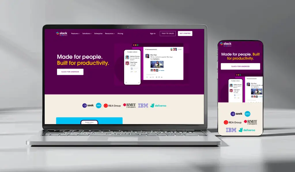
Slack’s website reflects its brand values of simplicity and user-focused design. The layout adjusts smoothly to different screen sizes, changing from three columns on desktops to a single column on mobile devices.
The call-to-action buttons cover the entire column on tablets and phones, making it easier to use without accidentally clicking on other links.
The menu is simplified into a hamburger menu, and the number of CTAs is reduced to a prominent “Try for Free” button that takes up most of the screen on smaller devices. This clean design ensures a user-friendly experience, with content neatly organized into one column for simple navigation.

Etsy’s site showcases effective responsive design, adjusting well to various devices. The layout stays mostly the same on desktops and tablets, with some small design tweaks. But on mobiles, the navigation bar is hidden to keep things neat, and the grid layout shrinks for smaller screens.
The search bar is always visible, showing Etsy knows users often come with a purpose. With a focus on personalization and easy product access, Etsy’s mobile-first design offers a smooth, user-friendly experience that showcases important content effectively.

WIRED’s website has a layout that changes depending on the device you’re using. On desktops and tablets, it has multiple columns, but on mobile, it switches to a single column for easier reading.
The mobile version simplifies navigation by showing only the logo, menu icon, and subscribe link, and it doesn’t include search and filtering options to keep it simple. WIRED also uses flexible images that adjust to different screen sizes, with a consistent 16:9 ratio on mobile, making the content easy to access and ensuring a smooth user experience on all devices.
Inspired by These Responsive Web Design Examples?
Let’s make these responsive features live on your website. Contact us today to start transforming your site with our expert responsive web design services.
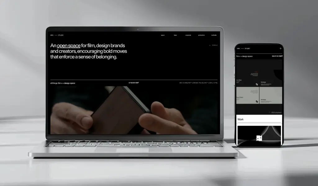
VMV Studio, a creative hub for designers, filmmakers, and visionaries, showcases its innovative spirit through its website’s dynamic design. The site is brought to life with animations, bold graphics, and videos, reflecting the studio’s creativity and technical expertise. Subtle details like a frosted glass footer and text that fills on scroll add a unique touch.
On mobile devices, VMV Studio maintains the same vibrant design elements without compromising load times. The mobile version retains the high-quality videos, scroll effects, and full range of content seen on larger screens. The portfolio grid transitions from a more spacious arrangement on desktops to a streamlined single-item-per-row format on mobile, ensuring a smooth and user-friendly scrolling experience.

Forefathers Group excels in responsive design, seamlessly adapting its sophisticated, artful website across devices. On tablets and desktops, the site uses full-width layouts and ample whitespace to enhance visibility and user experience.
However, on mobile screens, the top navigation shifts to a vertical format, and the CTA is simplified to “Hire us” to reduce clutter. The hero image also scales down to fit the smaller screen.
Overall, Forefathers Group demonstrates a keen attention to detail and a commitment to delivering a visually engaging experience on all devices.
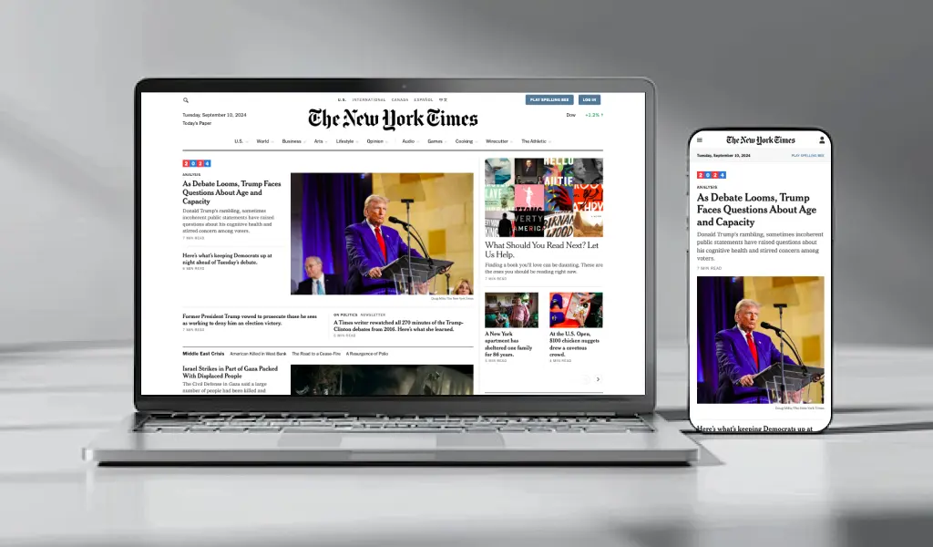
The New York Times website effectively mirrors its traditional newspaper format with a responsive design that adapts seamlessly to different devices. On desktop, the site maintains a classic newspaper layout with variable grids, a prominent CTA for subscriptions, and a comprehensive footer.
On mobile, it transitions to a more compact design with a pop-up CTA, simplified navigation, and 1×1 grids for streamlined story presentation. The mobile version also integrates interactive elements like game links, ensuring a user-friendly experience that preserves the essence of the print edition while optimizing for digital accessibility.
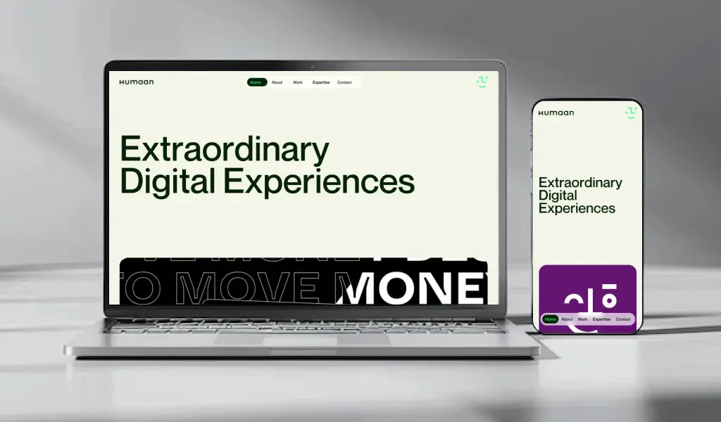
Humaan’s website showcases smart responsive web design with a modern, space-saving layout. The desktop version includes a floating navbar that switches to a compact hamburger menu when users scroll, keeping the design clean.
Promotional videos and blog thumbnails are arranged in attractive 2×1 grids, while the mobile version adjusts by placing the navbar below the main graphics and using 1×1 grids to maintain accessibility and visual appeal without sacrificing quality. This strategy guarantees a smooth user experience on all devices.
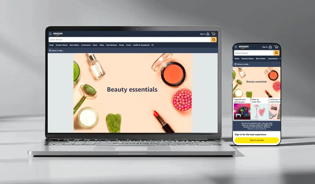
Amazon’s adaptive design exemplifies how a website can fluidly adjust across different devices while maintaining core functionality. On a desktop browser, scaling the window may cause content to extend beyond the screen, but when accessed via mobile, Amazon shifts to a completely different layout with a streamlined visual hierarchy.
Despite these differences, Amazon maintains core functionality across devices: the search bar remains prominently displayed, ensuring users can efficiently find products regardless of their device. Mobile design may streamline or remove certain elements, but the essential workflow of searching for consumer goods is preserved, enhancing usability and load times while catering to varying user behaviors.
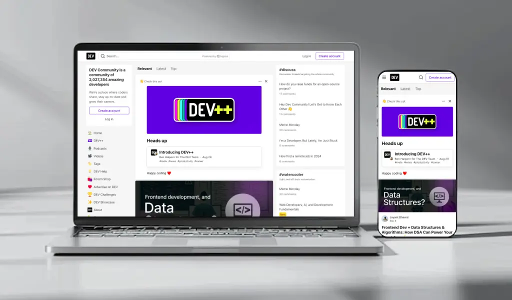
Google is now considering load times when ranking websites, so mobile-friendly designs like dev.to’s are becoming more popular.
Dev.to removes unnecessary features from its mobile version, like job listings and newsletters, to make the user experience smoother. This focus on simplicity ensures fast load times and easy browsing. It shows the trend towards mobile-friendly designs that prioritize performance and user satisfaction.

Apple initially lagged in adopting responsive design, but its online presence has since transformed into a prime example of interactive scrolling. The iPhone 12 Pro product page is a standout, featuring bold white text on a dark background that highlights key features such as “Less bezel, more screen” and “Surgical grade stainless steel.”
As users scroll, the text and images smoothly transition, creating a visually stunning effect similar to a Star Wars opening. The seamless integration of desktop animation effects on mobile devices ensures a top-notch experience, even when full-width images are resized. Mobile animated reflections maintain the page’s captivating appeal, showcasing Apple’s dedication to consistent and immersive design on all platforms.
Boost Your Online Visibility with Professional Responsive Website Design Services
In today’s digital era, it’s essential to have a website that works well on all devices. Responsive web design makes sure your site looks good and works well on desktops, tablets, and smartphones. This helps improve user satisfaction and engagement. Investing in responsive design can attract more mobile users, boost your site’s SEO, and leave a strong impression on your audience.
We at WebyKing specialize in creating responsive and visually appealing websites that are tailored to your business. Our expert team uses the latest technologies to make sure your website looks great and works perfectly on any device. Let us help you improve your online presence and reach a wider audience with a standout website. Get in touch with us today to find out more about our responsive web design services and how we can help your business succeed in the digital world.
FAQs on Responsive Web Design
What Tools Can I Use to Test Responsiveness?
To test the responsiveness of your website, you can use various tools such as Google Chrome Inspect, Responsinator, Google DevTools Device Mode, Browser Stack, CrossBrowserTesting, Testsigma, LambdaTest, Am I Responsive?, ResponsiveTest, Viewport Resizer, resizeMyBrowser, Screenfly, Responsive Web Design Test Tool by Designmodo, Responsive Web Design Testing Tool by pixeltuner.de, and responsivepx.
How Often Should I Update My Responsive Design?
Update your responsive design regularly, especially when new devices come out, during major redesigns, from user feedback, and at least once a year.
Can Any Website Be Made Responsive?
Yes, any website can be made responsive with the right design and development techniques.
What are Some Other Popular Responsive Web Design Examples?
Some other famous examples of excellent responsive web design include Airbnb, The Guardian, and Starbucks.
Ravi Makhija, the visionary Founder and CEO of WebyKing, is a seasoned digital marketing strategist and web technology expert with over a decade of experience. Under his leadership, WebyKing has evolved into a premier full service web and marketing agency, delivering innovative solutions that drive online success. Ravi’s deep understanding of the digital landscape combined with his passion for cutting-edge technologies empowers him to consistently exceed client expectations and deliver results that matter.


