
Responsive web design isn’t just a trend—it’s a necessity. With more people accessing websites from mobile devices, ensuring your webpage looks great on any screen size is essential.
You know over 60% of global web traffic is generated with mobile devices now? That’s a big part of the online audience, and if you don’t have a mobile-optimized website, you’re missing out on major traffic.
Responsive Design Principles ensure that your site adapts to whichever device it’s being viewed on—be it a smartphone, a tablet, or a desktop. No more pinching or zooming to decipher tiny text or cluttered pages. It’s about making sure every user has a seamless experience, no matter what device they use.
In this blog, we will deep dive into the core Responsive Design Principles—because today, it’s not only about having a website, it’s about having one that works for everyone, everywhere. Let’s get into it!
By following responsive web design principles, a website changes automatically to look great on any device, whether it’s a smartphone, tablet, or desktop. Rather than relying on a traditional fixed layout typography, the website “responds” to the size of the screen, in that it will rearrange itself to fit on the device perfectly.
This means the best experience possible for users, regardless of device.
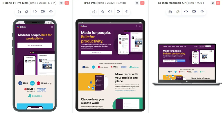
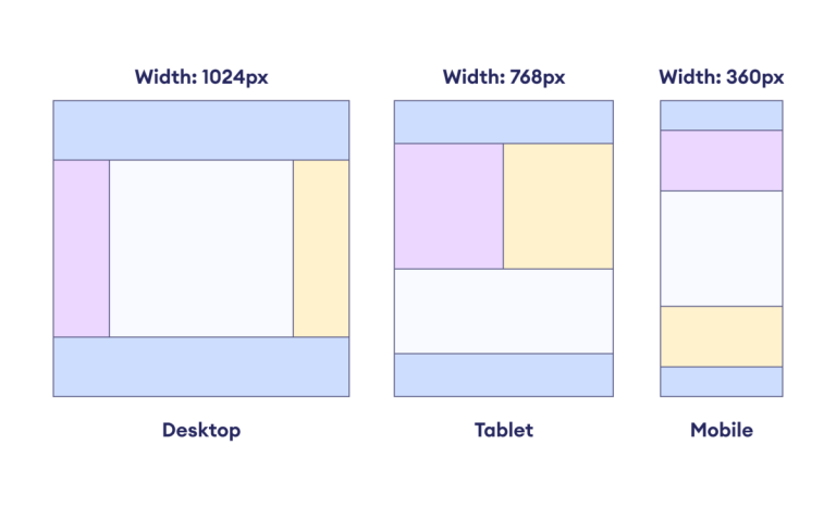
The figure above shows how Slack scales to different devices.
In short, a responsive design website resizes itself depending on what the person visiting your site is using to browse: a small pocket phone or a big desktop screen. This flexibility explains why so many companies are making sure they work with a website design company that knows how to build responsive websites. This is very useful for ensuring that your site works well for each of your visitors regardless of how they access it.
“Just like a tree bends with the wind, a website must bend to fit the screen.”
This flexibility is at the heart of responsive design. To build a truly adaptable website, you need to understand the key principles of responsive design. These principles ensure your site adapts beautifully across all devices. By following these, you can create a seamless, user-friendly experience that works perfectly, no matter the screen size.
Let’s explore these essential responsive design principles that will help your website stay flexible, functional, and engaging!
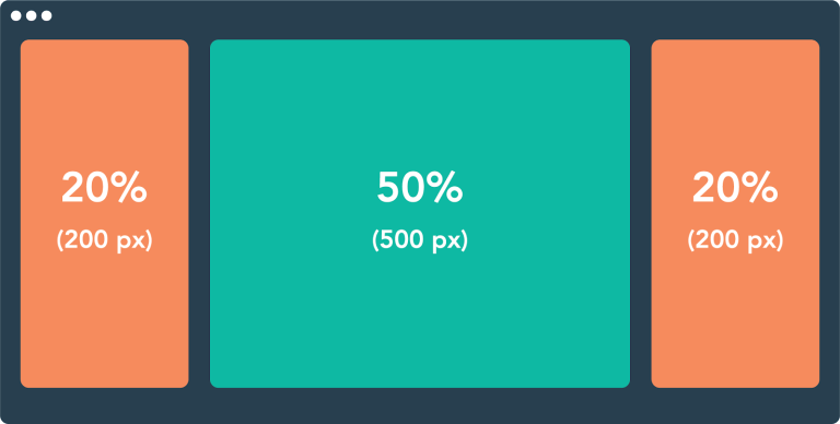
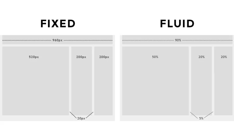
A fluid grid system is all about creating flexible layouts that scale based on the size of the screen. Rather than using fixed pixel widths, fluid grid uses percentages, allowing elements like columns, images, and text to resize relative to the screen. This ensures that no matter how big or small the screen is, your website adjusts and fits perfectly.
Source: HubSpot
In a regular design you would set the width of your elements in pixels. For instance, you could make a column 600px. but on smaller screens, that column might be too wide, i.e., with a fluid grid, instead of 600px you might set the column to 50% of the screen width, so that it resizes proportionally according to screen size.
Fluid grid creates a dynamic layout that makes your website adaptable to any screen. It’s like setting up a room that looks good whether it’s in a tiny apartment or a huge mansion.
Pre-defined grid systems offered by grid frameworks such as Foundation and Bootstrap make it easier to create flexible layouts. Furthermore, CSS methods like Flexbox and CSS Grid Layout provide strong instruments for creating responsive grids with exact control over element alignment, spacing, and arrangement.
Fluid image use is the practice of making sure your images adjust based on the size of the screen. You don’t want a big, heavy image to look distorted or too small when viewed on different devices. With fluid images, the images automatically resize, ensuring they’re sharp and well-proportioned no matter the device.
Imagine you have a header image on your website. If you set it to be 100% width, it will stretch across the entire screen, whether you are on a desktop, tablet, or mobile. This keeps your website looking sharp without those awkward black spaces or stretched-out images.
Media queries are like instructions you give your website about how to behave on different screen sizes. They allow you to apply different CSS styles depending on the device’s screen size, resolution or even the orientation (landscape or portrait).
Media queries make it possible to tweak the layout and design for specific devices, without changing the entire website.
You can write media queries in your CSS that tell the browser to use certain styles based on the screen size.
Source: Programiz
For example, you might tell the website to switch to a mobile-friendly layout when the screen width is less than 768px (like on tablets and phones). The media query will ensure that the content rearranges or resizes accordingly.
A common media query might look like this:
@media (max-width: 768px) {
/* Styles for devices with a screen width of 768px or smaller */
.sidebar {
display: none;
}
.main-content {
width: 100%;
}
}
This would hide the sidebar and make the main content take up the full width on smaller screens, making it more readable and user-friendly.
Media queries are like having a set of tailored outfits for your website. Depending on whether you’re designing for a phone, tablet, or desktop, the styles change to fit perfectly, giving users a great experience no matter what device they’re using. It’s the secret ingredient that makes responsive design truly shine!
Mobile-first design is an approach that starts the design process with mobile devices and works its way up to larger screens such as tablets and desktops. This is because mobile internet usage now exceeds that of desktop in many regions.
The design that works well with a mobile version means you can start adding more bells and whistles as you scale your design up to larger screens. This also makes mobile-first design more streamlined, with attention focused on the core elements and avoiding useless bloat.
Websites such as Google & YouTube are perfect examples of mobile-first design. These platforms begin with the most basic experience available to mobile users and build on top of that additional features (think: more extended menus, more complex layouts) for larger screens.
This is particularly important for navigation in responsive design when users deal with websites on small screens. The aforementioned is known as the other secret simple navigation star — making the menus easy to use and visually accessible.
That may mean changing a navigation bar to a hamburger menu — particularly on mobile devices — or using collapsible menus to conserve real estate on smaller formats. The goal is to reduce clutter and increase ease of navigation irrespective of screen size.
As more people use touchscreens to interact with websites, especially on mobile devices, it’s important to design elements that are optimized for touch.
This means buttons should be large enough to tap easily, links should be spaced approximately to avoid accidental clicks, and interactive features should respond well to swipe gestures or taps. Designing with touch in mind ensures users can navigate the site intuitively without frustration.
Small text links or crowded buttons on small devices are one of the main reasons users abandon websites. Touchscreen-friendly design eliminates these challenges by making everything large enough to be tapped easily.
Button Size: Buttons should be at least 44 X 44px to ensure they’re easy to tap (recommended by Apple).
Spacing: Leave ample space between touch targets (like links or buttons) so users can interact with them without difficulty.
Responsive design also requires thoughtful consideration of typography. While fonts may look great on a desktop screen, they might appear too small or too large on mobile devices.
With responsive typography, font sizes adjust based on the screen size, ensuring readability across devices. Additionally, using the right font family, line-height, and spacing ensures that text is legible and easy to read, no matter where it’s being viewed.
Mastering responsive web design basics lays the foundation for long-term adaptability. Responsive design isn’t just a one-time implementation; it’s a journey As your audience and technology evolve, your website needs to adapt. Start by implementing the key principles today, and continuously monitor and test your site for performance across all devices. Using responsive website design testing tools — like browser emulators, device simulators, and cross-device testing platforms — will help you verify how fluid grids, media queries, and flexible images behave in real-world scenarios before you launch or update.
If you need expert guidance, a responsive web design company can help you stay ahead of the curve, ensuring your site grows and evolves alongside your audience.
Responsive web design ensures that a website automatically adjusts to fit any screen size, offering a seamless user experience across mobile phones, tablets, and desktops. It’s crucial because over 60% of web traffic comes from mobile devices.
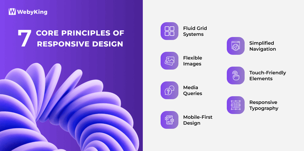
The main principles of responsive design include fluid grid systems, flexible images, media queries, mobile-first design, simplified navigation, touchscreen-friendly features, and scalable typography.
A fluid grid system uses relative units like percentages instead of fixed pixels, allowing website elements to resize proportionally based on screen size. This keeps layouts flexible and consistent on all devices.
Media queries let developers apply different styles depending on the screen’s size, resolution, or orientation. This allows websites to adapt layout and content dynamically for better usability.
Mobile-first design starts with the smallest screen sizes and builds up, ensuring the most essential content and features work perfectly on mobile before scaling up to larger screens.
To design for touchscreens, ensure buttons are large enough (at least 44x44px), links have enough spacing, and interactive elements respond well to taps and swipes to avoid user frustration.
Responsive typography uses relative units like em or rem for font sizes and adjusts line height and spacing to maintain readability across different screen sizes and resolutions.
Ravi Makhija, the visionary Founder and CEO of WebyKing, is a seasoned digital marketing strategist and web technology expert with over a decade of experience. Under his leadership, WebyKing has evolved into a premier full service web and marketing agency, delivering innovative solutions that drive online success. Ravi’s deep understanding of the digital landscape combined with his passion for cutting-edge technologies empowers him to consistently exceed client expectations and deliver results that matter.

Let’s turn your ideas into impact—reach out and let’s build something exceptional together.
Customer
Retention Ratio
Certified Professionals
Projects
Years of Experience


TRUSTED BY 100+ CLIENTS, WITH OVER 100 PROJECTS SUCCESSFULLY DELIVERED AS A FULL-SERVICE WEB AGENCY
TRUSTED BY 100+ CLIENTS, WITH OVER 100 PROJECTS SUCCESSFULLY DELIVERED AS A FULL-SERVICE WEB AGENCY
TRUSTED BY 100+ CLIENTS, WITH OVER 100 PROJECTS SUCCESSFULLY DELIVERED AS A FULL-SERVICE WEB AGENCY
Web Design By Industry
Digital Marketing
eCommerce Web Design
SEO Services
Lead Gen By Industry
Migration By Platform
PPC By Industry
Maintenance By Platform
Our Presence
Expand your business digitally on a global scale! We’re always ready at your service, with dedicated teams in three key international locations.
5354 Denny Ave, North Hollywood, Los Angeles, CA 91601, United States.
9720 Jones Rd, S210, Houston, TX 77065, United States.
The Spire, Office No: 312, Near Ayodhya Chowk BRTS Bus Stop, 150 Feet Ring Road, Rajkot
Share your details below and we’ll get back to you soon.
We’ll get back to you shortly.


