11 Benefits of Having a Responsive Web Design for Your Business

Updated on: February 5, 2026
Reading Time: 7 minutes
Post Views: 90
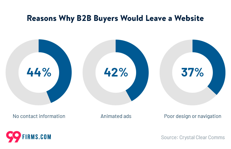
Responsive web design means your website automatically adjusts to different screen sizes and devices, offering users an optimal viewing and browsing experience. Check out the stats, and you’ll see why.
|
Do you often struggle with website clutter or find it difficult to navigate on your phone?
You are not alone. With users expecting a seamless experience across all devices, any website that does not emphasize responsive design will lose out on a significant amount of traffic in today’s digital-first world.
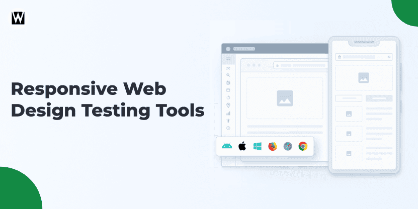
To ensure that your responsive design performs well on real devices and screen sizes, it’s helpful to use responsive website design testing tools during development and updates. These tools let you preview how layouts, navigation, and content behave across a wide range of devices, ensuring your design truly delivers a seamless experience.
As we discussed earlier, a Google study states that over 57% of users would not recommend a business with a poorly designed mobile site. This is where responsive website design steps in, providing a layout that conforms so that everything on your site looks sharp and works effectively on any screen size.
Source: 99Firms
Responsive design isn’t just about aesthetics – it’s about creating a user-friendly experience that drives engagement. When your website adjusts smoothly to different devices, it sends a clear message: your brand cares about the user experience.
Now, without any ado, let’s take a look at the benefits of using a responsive web design.
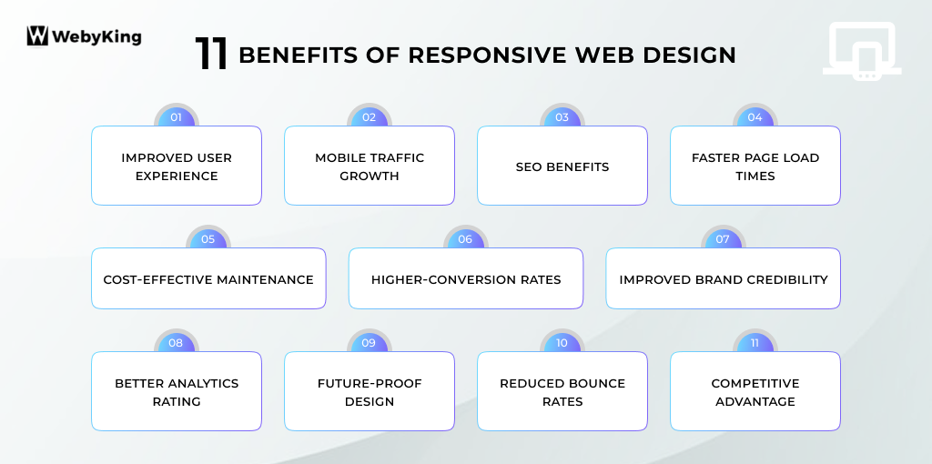
Improved User Experience
Responsive websites provide smooth, unified performance on all devices — from smartphone to tablet to desktop. This flexibility eliminates the irritation of zooming in or scrolling sideways, which ultimately allows users to absorb and engage with your content more effectively.
This is crucial for users to stay on your site, and how likely they are to interact with your media.
For example, if you go on a restaurant’s website on your mobile phone. When you open the website on your browser and the design fits your phone’s screen just right, you should be able to navigate the menu, the contact information, and a reservation easily. But if a site is not responsive, you may have to zoom in and out or squint to read tiny words, which may become a hassle and can easily frustrate the customers, eventually driving them away.
Mobile Traffic Growth
With mobile devices accounting for a significant portion of global web traffic, responsive design ensures your website is optimised for mobile users, where most visits now originate.
If your site is not mobile-friendly, you risk losing a large segment of your audience who may quickly abandon it in favour of a more user-friendly, responsive competitor.
As more users rely on smartphones and tablets for internet access, ensuring your site is responsive is no longer a luxury – it’s a necessity.
According to Statista, more than 54.8% of global web traffic comes from mobile devices, and this trend is not only increasing, making mobile optimization a key factor in maintaining and growing your website’s traffic.
SEO Benefits
Google has made it clear that responsive design is a ranking factor. With its mobile-first indexing, Google prioritizes mobile-friendly websites, boosting their visibility in search results.
A responsive website improves user experience and strengthens SEO efforts by providing consistent content across all devices.
If you have separate mobile and desktop versions of your site, it could cause duplicate content issues, which negatively impact your search rankings. A single responsive website streamlines SEO, ensuring your content is indexed correctly across all devices.
Faster Page Load Times
A responsive design is optimized to load quickly across different devices, ensuring visitors don’t have to wait for content to appear. Speed is a critical factor for user retention, if a site takes too long to load, users are more likely to leave and turn to a competitor.
Faster loading times are also crucial for improving your site’s SEO rankings, as search engines like Google consider page speed as an important factor in their algorithms.
FACT
53% of mobile site visits are abandoned if the page takes more than 3 seconds to load (Google).

Cost-effective Maintenance
A responsive website requires only one version to manage, in contrast to separate desktop and mobile sites. With a single design that responds to any screen size, you will only have to update and maintain your site version, saving development costs and time.
You do not need a separate version of blog posts or product pages for a different device, this efficiency also extends to content management. Even if it’s just a minor change for your design, or a more major update on your site, it’s one-time work that can save you a lot over the years.
Higher-conversion Rates
Responsive websites deliver a better experience that keeps visitors engaged and encourages them to act. From checking out, to subscribing to a newsletter, to filling out a contact form, a smooth mobile experience can lead to a substantial increase in conversion rates.
Responsive design principles allow your users to feel comfortable navigating your website, regardless of the device they are using.
In other words, if you have an online store, responsive design will help visitors seamlessly browse products, add items to their cart, and finalize their purchase, regardless of the device they use. Implementing these core responsive design principles can lead to a user-friendly experience that increases the likelihood of completing purchases, thus raising sales and conversions.
Improved Brand Credibility
A well-designed, responsive website reflects positively on your brand’s image, demonstrating that you value user experience and are keeping up with modern web trends. When users encounter a responsive site, it signals professionalism and attention to detail, which helps build trust and credibility with your audience.
Conversely, a non-responsive or outdated website can create doubts about your business’s reliability and professionalism.
A responsive design ensures your company’s website appears sleek and functional across devices, whether potential customers are browsing on a laptop or smartphone. This increases the perceived legitimacy of your brand, leading to stronger customer relationships.
Better Analytics Rating
With a responsive design, tracking user behaviour across different devices becomes much easier. Instead of having separate tracking codes for your mobile and desktop sites, you can monitor all of your site’s traffic from a single analytics account.
This simplifies data analysis and provides a clearer view of how users interact with your content. Understanding where visitors are coming from, what devices they use, and how they navigate your site is important for making data-driven improvements.
Future-Proof Design
Responsive web design future-proofs your website by responding to new devices and screen sizes. Responsive design makes sure that when the digital world changes and new smartphones, tablets, and other devices come out, your site will look the way you want it to and work properly on all of them.
Most sites in the past were fixed width, which potentially includes the oldest ones, as fixed-width sites may never be updated if the website does not update. Responsive websites adapt to changes, unlike fixed-width sites, which can go obsolete with evolving screen sizes.
This allows you to not be forced to constantly update to redesign your site according to technology advancements.
Reduced Bounce Rates
So, a responsive site will decrease the rate of users bouncing from your site out of frustration. By ensuring your website is mobile and desktop user friendly, visitors spend longer on your site, consume more of your content and use your services.
An intuitive, responsive site helps users find what they’re looking for quickly, resulting in longer retention and lower bounce rates.
According to a Blue Corona statistic above, over 48% of the users have the same view that a website design is the first element that helps determine a business’s credibility. An accessible site across all devices increases user trust and lowers bounce rates.
Competitive Advantage
Having a responsive website gives you a distinct edge over competitors still using outdated designs. As more businesses recognize the importance of mobile optimization, those who don’t adopt responsive design risk falling behind.
A responsive site signals that your brand is modern, adaptable and user-centric, which can set you apart in a competitive marketplace. If your competitor’s site isn’t responsive, users are more likely to choose your site for its ease of use and superior experience.
For instance, a fashion retail store with a non-responsive website. While the competitor’s responsive design offers a sleek and easy shopping experience on any device, the non-responsive site frustrates users with small text and hard-to-click buttons.
To stay ahead, investing in responsive web design services is crucial for ensuring your site meets user expectations and keeps your brand at the forefront of digital trends.
Key Takeaways
If you’re looking to enhance or improve your website’s user experience across all devices, then responsive web design is the secret ingredient to add to your business strategy.
As people become increasingly “nomophobic” and access content on their phones more than ever, the challenges related to responsive web design will only continue to grow. Recent advancements in responsive design have focused on accommodating smaller screens, and this trend shows no signs of slowing down.
The benefits of responsive design have a strong positive impact on both brands and customers. If you’re ready to get started but aren’t sure where to begin, we’ve got you covered. Contact us today and get an outstanding responsive website tailored to your business.
FAQs
What is responsive web design?
Responsive web design means a website automatically adjusts to fit any device screen—mobile, tablet, or desktop—offering an optimal user experience.
Why is responsive web design important for businesses?
It improves user experience, boosts SEO rankings, increases conversions, and ensures your site works smoothly on all devices.
How does responsive design affect SEO?
Google favors responsive sites in mobile-first indexing, improving your site’s ranking by providing consistent content across devices.
Does responsive web design improve website speed?
Yes, responsive websites load faster on all devices, which reduces bounce rates and improves search engine rankings.
Can responsive web design save maintenance costs?
Because you manage only one site version, responsive design lowers development and content update costs.
How does responsive design improve user experience?
It eliminates the need for zooming or horizontal scrolling, making navigation easy and content accessible on any device.
Will responsive web design increase conversions?
Yes, a smooth experience encourages users to take actions like purchasing or contacting you, boosting conversion rates.
How does responsive design enhance brand credibility?
A professional, easy-to-use site builds trust and shows that your business values user experience.
Does responsive web design reduce bounce rates?
By making your site easy to use and fast-loading, responsive design keeps visitors engaged longer and lowers bounce rates.
Is responsive web design future-proof?
Yes, it adapts to new devices and screen sizes, ensuring your website remains functional as technology evolves.
Ravi Makhija, the visionary Founder and CEO of WebyKing, is a seasoned digital marketing strategist and web technology expert with over a decade of experience. Under his leadership, WebyKing has evolved into a premier full service web and marketing agency, delivering innovative solutions that drive online success. Ravi’s deep understanding of the digital landscape combined with his passion for cutting-edge technologies empowers him to consistently exceed client expectations and deliver results that matter.


